User interface overview
By default, all IntelliJ-based IDEs use the following layout:

The main application window of all IntelliJ-based IDEs by default includes the following parts:
Main toolbar at the top
Stripes on the left and right sides that provide quick access to tool windows
Tool windows that surround the editor on the right, left, and bottom
Status bar at the bottom
IntelliJ Platform also provides the following container elements:
See the full list of UI components in Components.
Main toolbar
The main toolbar provides quick access to the most commonly used tools for managing the IDE and projects. The main toolbar is fully customizable, which means that the user may hide unnecessary widgets and buttons and add new ones.

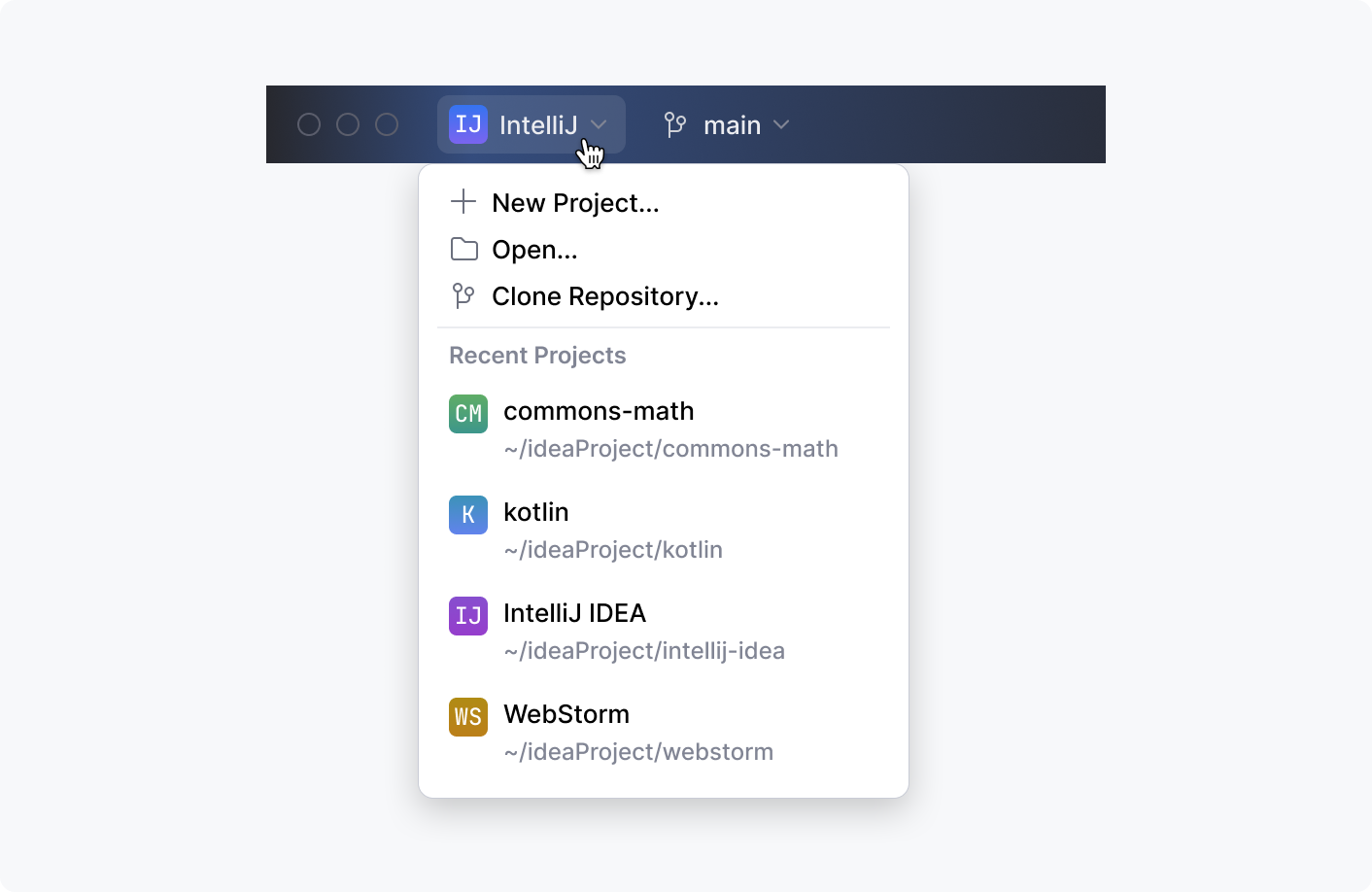
Project widget
A drop-down control that allows opening existing projects or creating new ones:
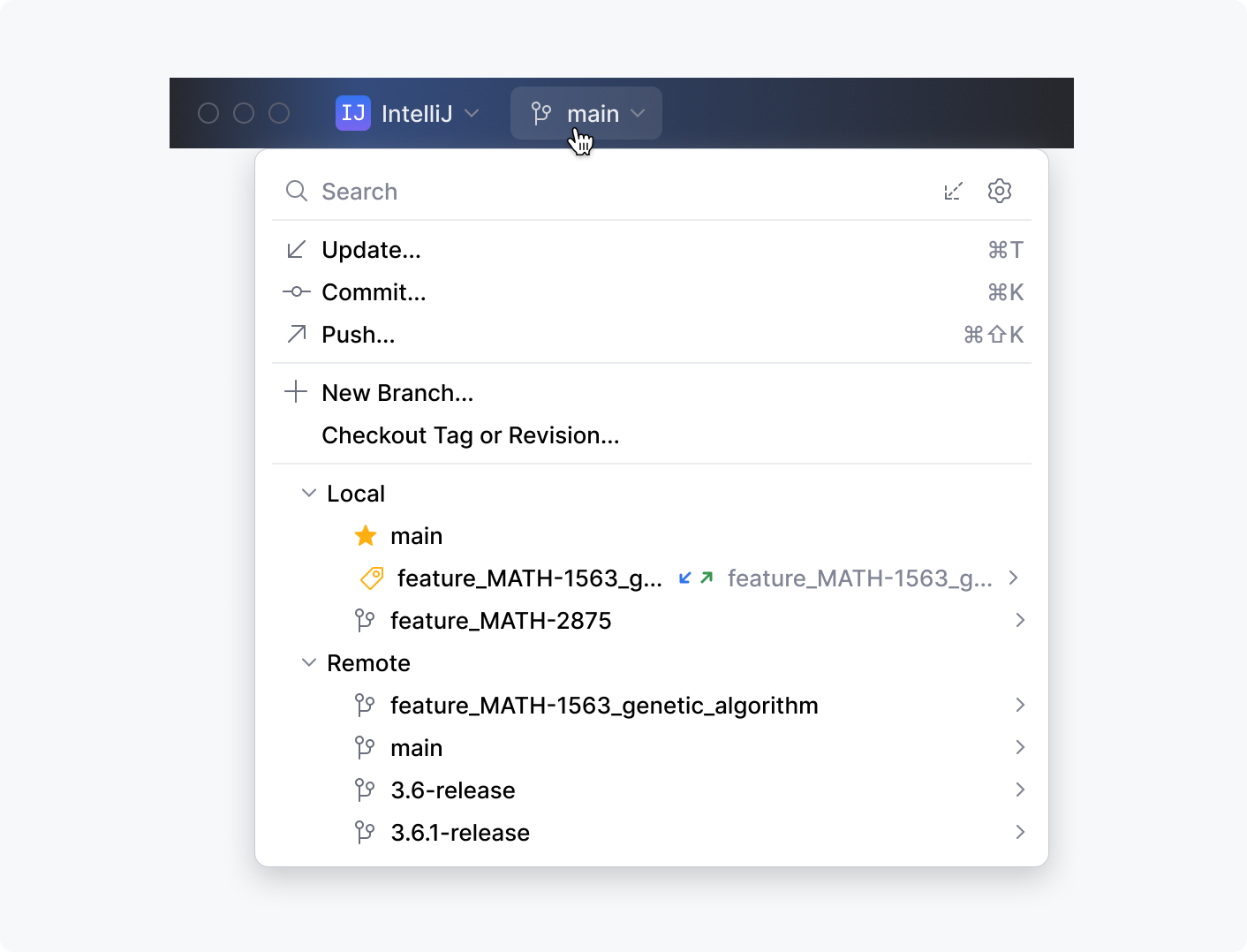
VCS widget
A drop-down control for managing VCS branches:
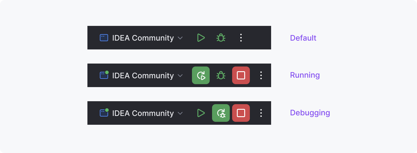
Run widget
A drop-down control for choosing run configurations and buttons for running and debugging the code:
Toolbar buttons
The icon buttons that provide quick access to Search, Settings, and other important IDE features.

Main menu (on Windows and Linux)
On Windows and Linux, the toolbar also includes the Hamburger button:

On clicking the Hamburger button, the menu items are shown on the right:

You can also opt for showing the menu above the toolbar:

Tool windows
Tool windows are the panes inside the main application window that serve for solving different tasks, for example, navigating through the project files in the Project tool window or working with Terminal in the Terminal tool window:
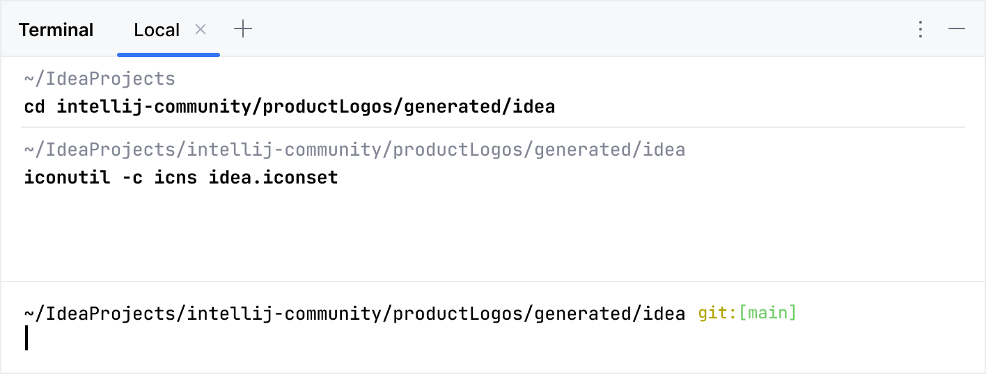
See more in Tool windows.
Stripes
The left and right sides of the main window feature vertical stripes containing tool window buttons. These appear as icons by default but can be configured to display tool window names beneath them:
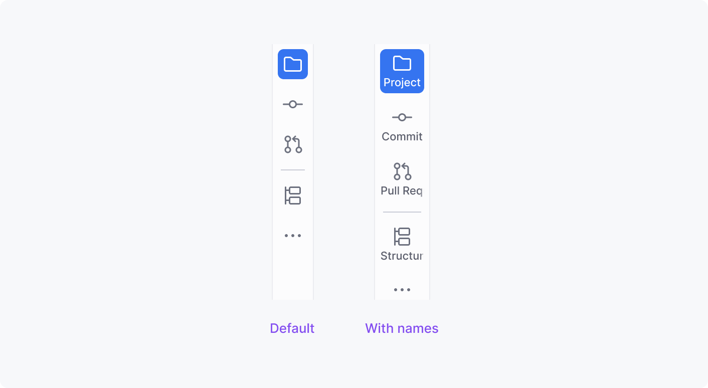
See more in Show and hide tool windows names.
Editor area
Editor area is the main working area in IntelliJ IDEs that is used to write, read, and modify code:
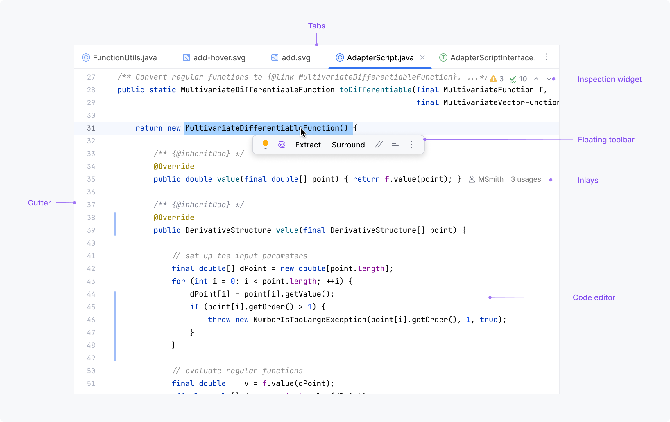
Code editor
The IntelliJ code editor provides highlighting, navigation, refactorings, and other powerful code insights features. See implementation details in Editor basics.
Editor tabs
Tabs display the file name and extension. They can be pinned, opened in separate windows or in a split view.

See more details on working with tabs in the editor in Editor tabs. For UI component reference, go to Tabs.
Inspection widget
A small control in the top-right corner of the editor shows the number of errors, warnings, and typos and allows navigating to the detailed view in the Project tool window.

See more in File and project analysis.
Gutter
A vertical area along the left side of the editor that provides important information and action icons within easy reach. It shows line numbers and buttons for folding, navigating, and running and debugging code along with VCS stripes and other controls.
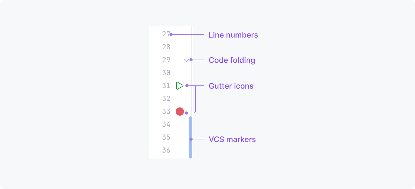
See more in Editor gutter.
Inlays
Hints that show additional information like parameter types or variable values and interactive controls for showing annotations, usages, and more.

See more in implementation details and user guidelines.
Floating toolbar
A small toolbar that appears when you select a code fragment in the editor. It contains buttons and controls for the most popular actions relevant in the current context, such as quick fixes, AI-actions, basic refactorings, and code-formatting options:
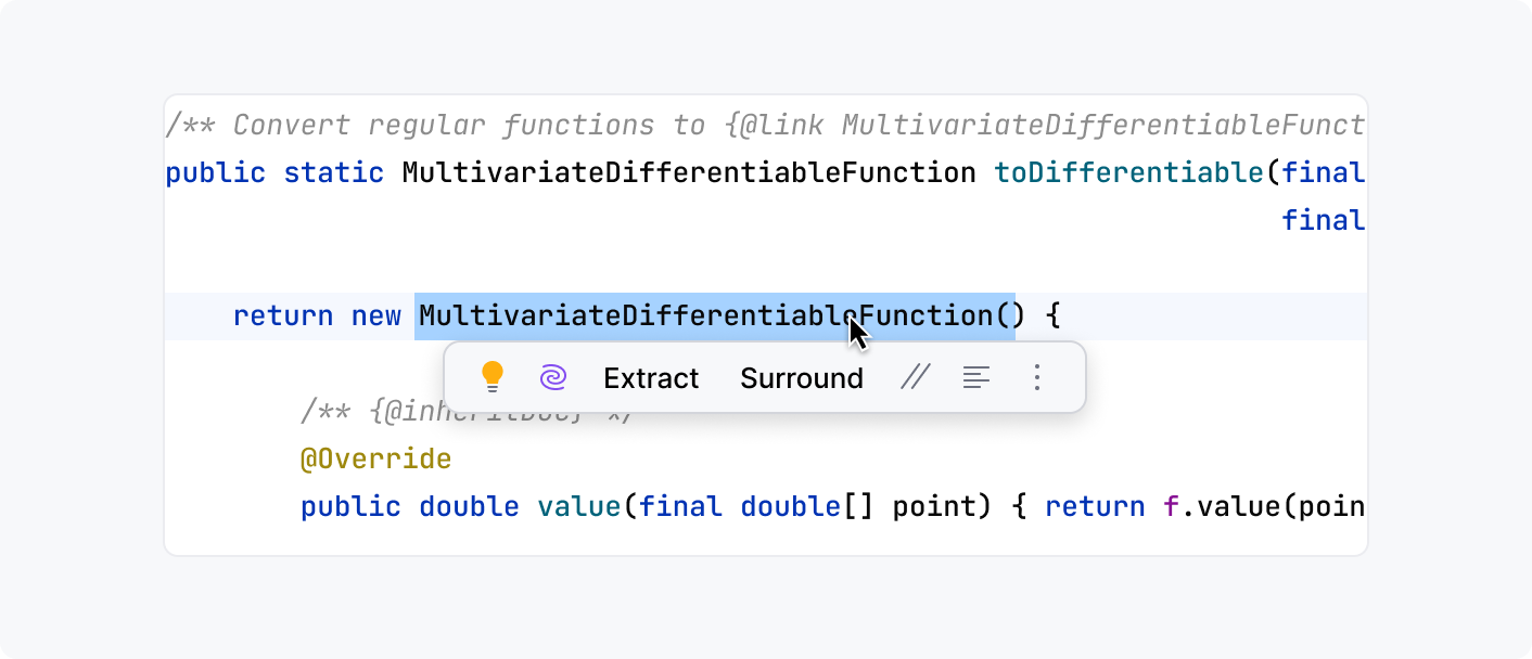
See more in Floating toolbar.
Status bar
The status bar on the bottom of the main window displays information on the current state of the project and the IDE as well as the path to the currently opened file:

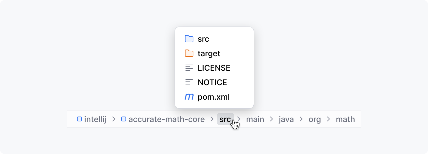
Navigation bar
The left part of the status bar by default is occupied by the navigation bar that is a compact alternative for the Project tool window. It shows a path to the selected file and allows you to go to other files and directories using this path:
Status bar widgets
The right part of the status bar contains status bar widgets which show statuses of various IDE and project settings and provide actions for changing these settings. For example, the indent widget shows the number of spaces for code formatting in the current file and allows users to change this number:

See more information on status bar widgets implementation in Status Bar Widgets.
Dialogs
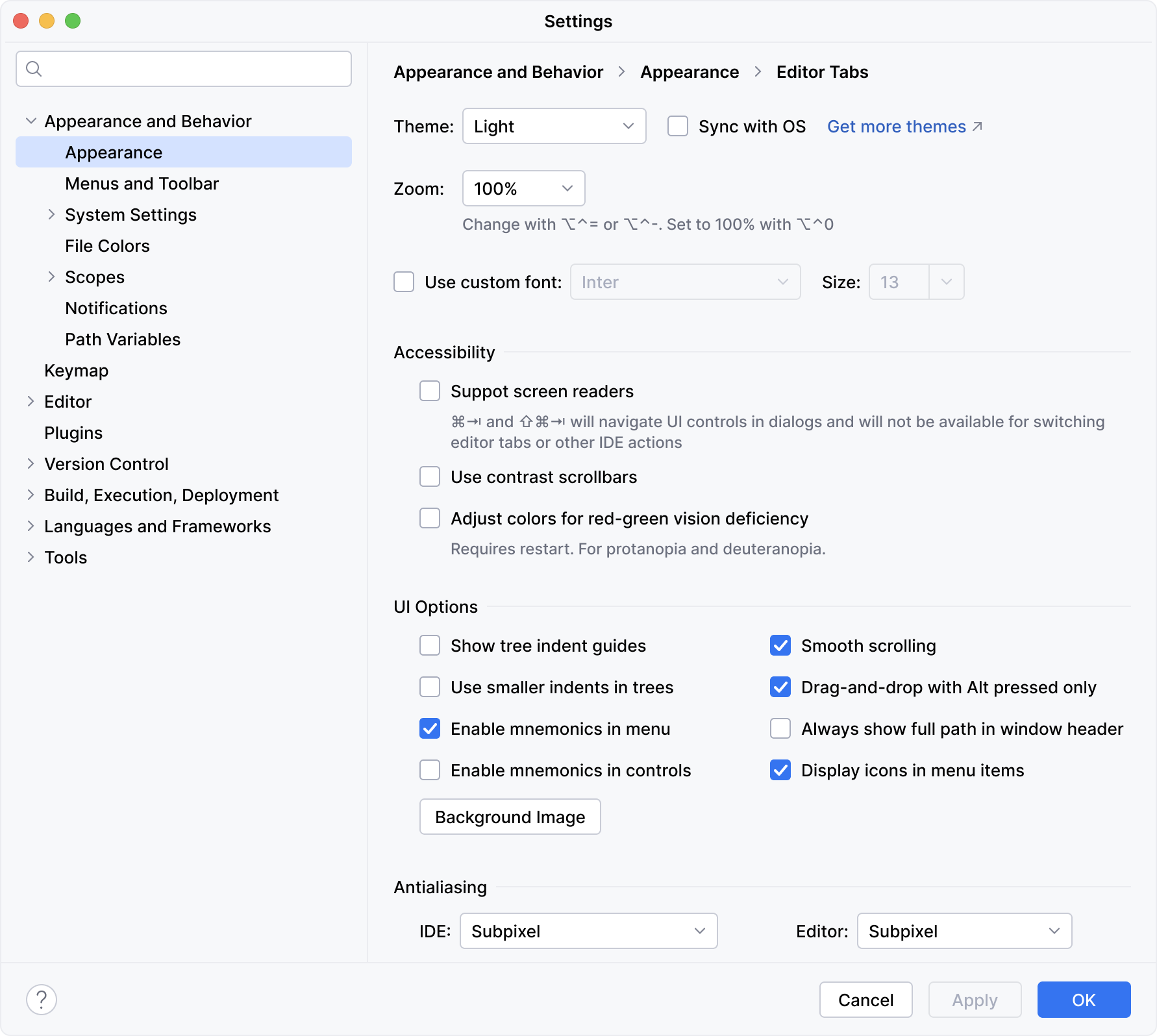
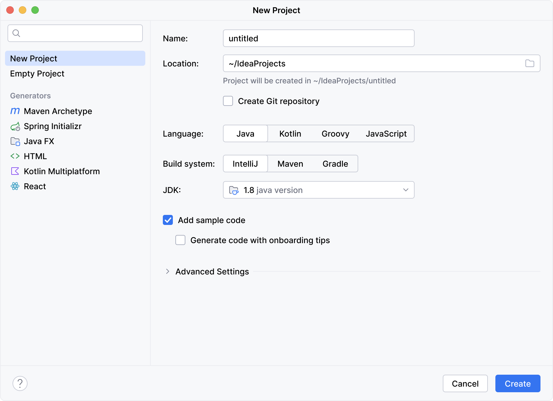
In the IntelliJ Platform, dialogs are modal windows that appear over the main application screen and require user actions to proceed. The dialogs might be used for different purposes, such as setting up the IDE and projects, creating new instances, asking for confirmations, and so on.
Dialog examples
Settings:
Welcome screen:

New project wizard:
Popups
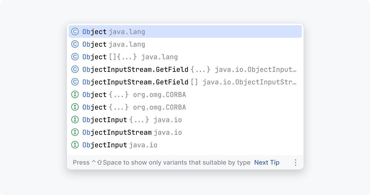
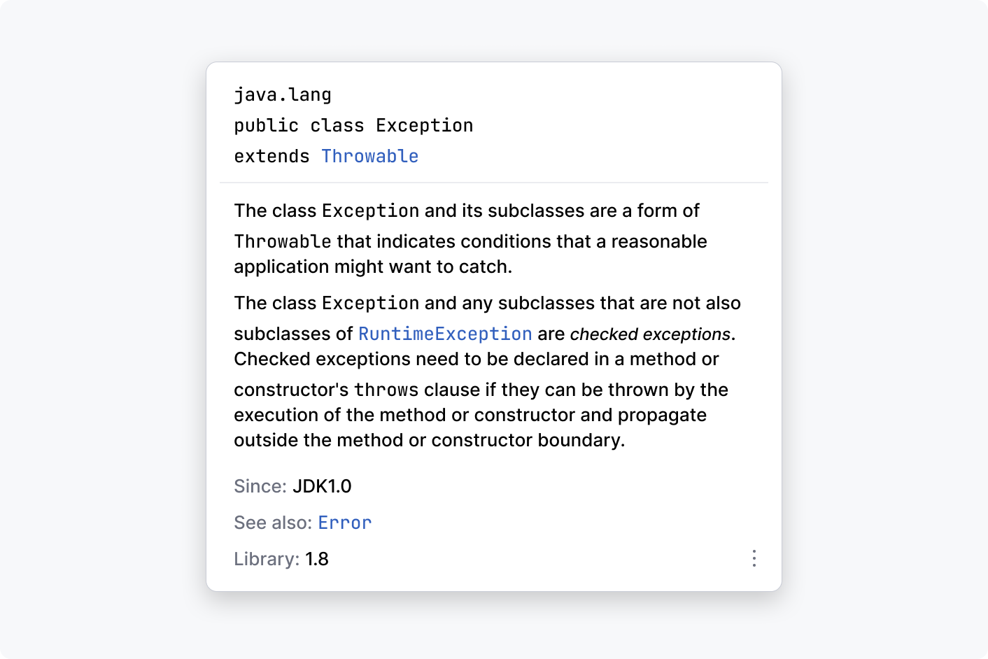
A popup is a lightweight window that appears above the application screen. Unlike the dialogs, popups do not have the standard OS title bar and are usually dismissed by clicking outside.
Popup examples
Completion popup:
Documentation popup:
Notifications
In IntelliJ Platform, different components are used to inform users about various events and status changes, depending on the severity and context of the message.
Balloons
Notification balloons inform users on the events or system states related to a project or IDE:

Alerts
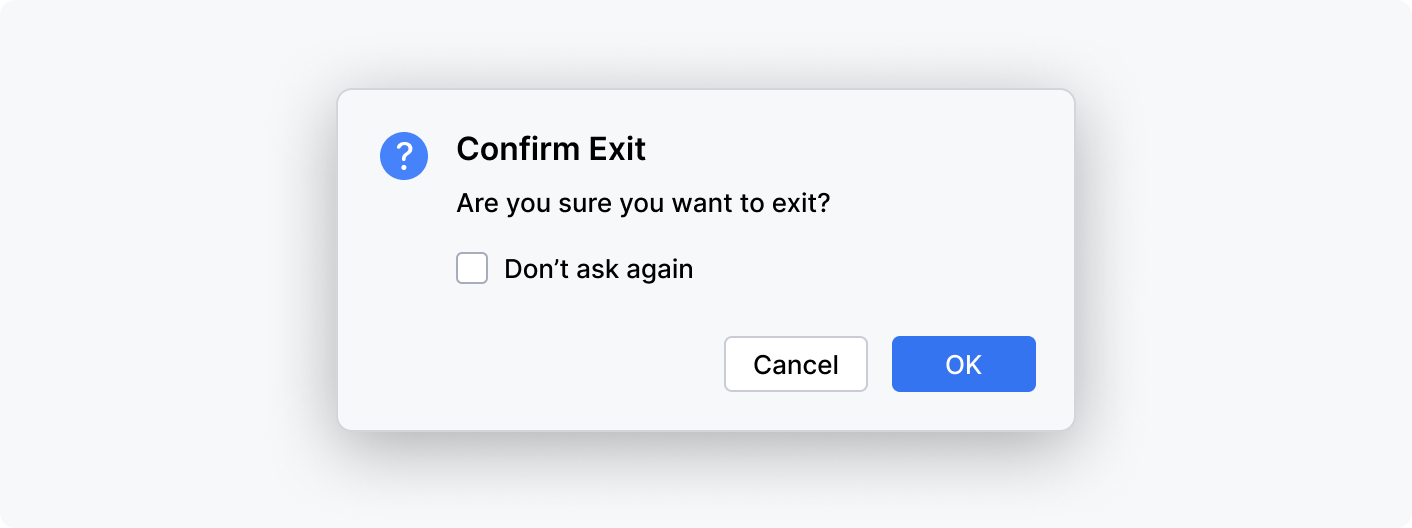
Alerts are modal windows that draw the user's attention to crucial information or ask for confirmation before proceeding:
Banners
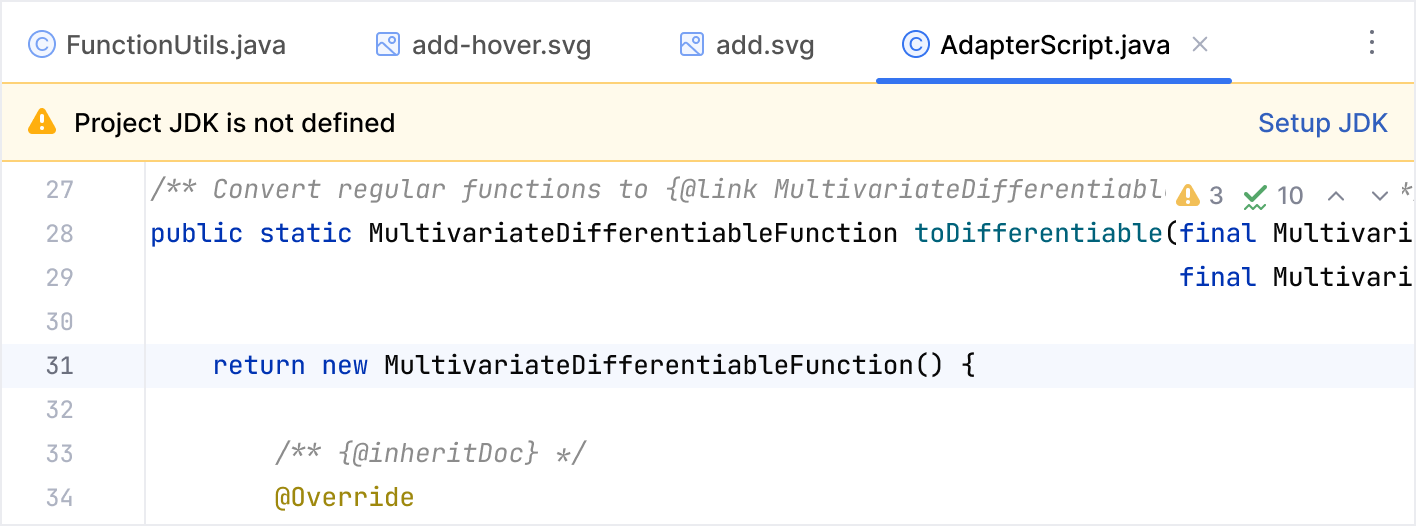
Banners appear on top of the editor or in tool windows. They inform the user about the state of a specific context and suggest context-related actions and quick fixes.
Context menus
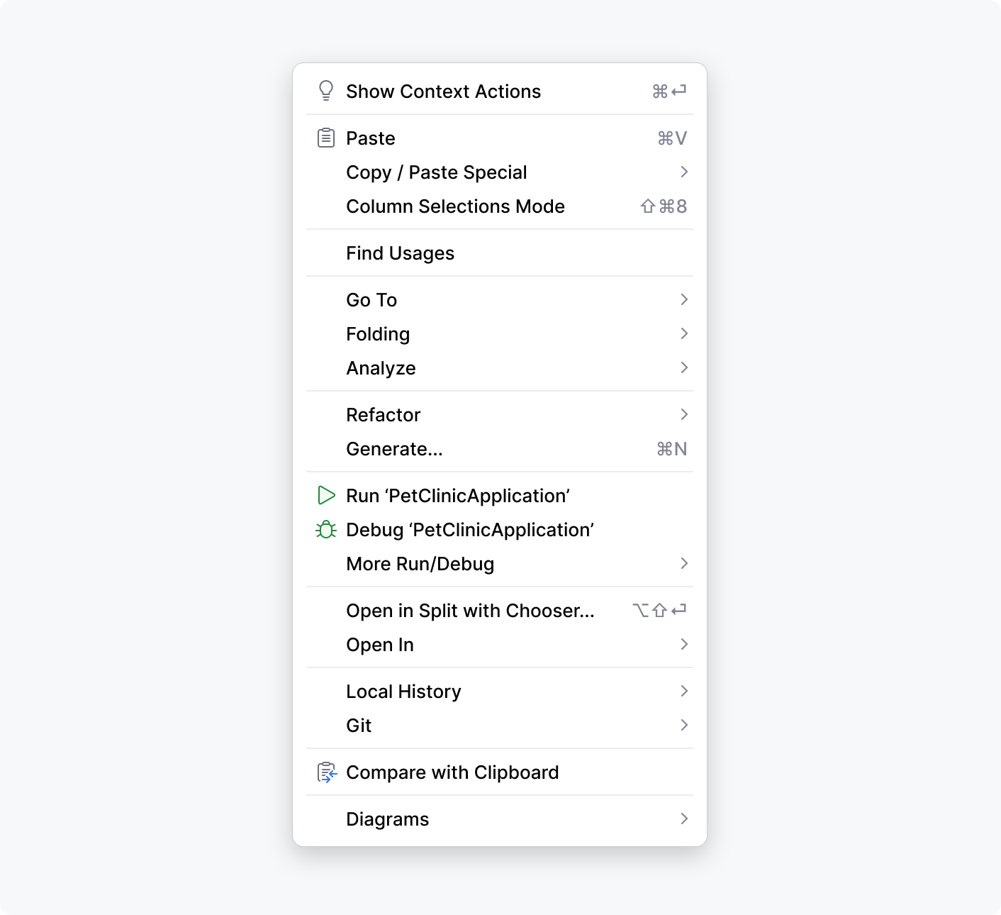
Context menus list actions available in the current context and open on right-click:
