Tabs

When to use
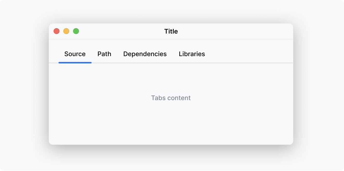
Use tabs to organize related content. Follow rules for Groups of controls.
How to use
Label
Use title capitalization for tab labels.
Make labels short, preferably no more than 3 words.
Avoid generic words such as "General" or "Advanced".
Correct

Incorrect

Tab Order and Layout
Place the most frequently used content in the first tab.
Tabs that do not fit allotted screen space automatically hide under the dropdown component. It is better to add no more than 8 tabs, but the number is not limited.

Unavailable content
Do not remove or disable a tab when its functions are unavailable. Explain why a tab’s content is unavailable in the body of the tab.
Placement
Position
Always place tabs on top of the content. It is possible to place them at other sides — bottom, left, or right — but such a placement is extremely rare and might confuse users.
Independent content
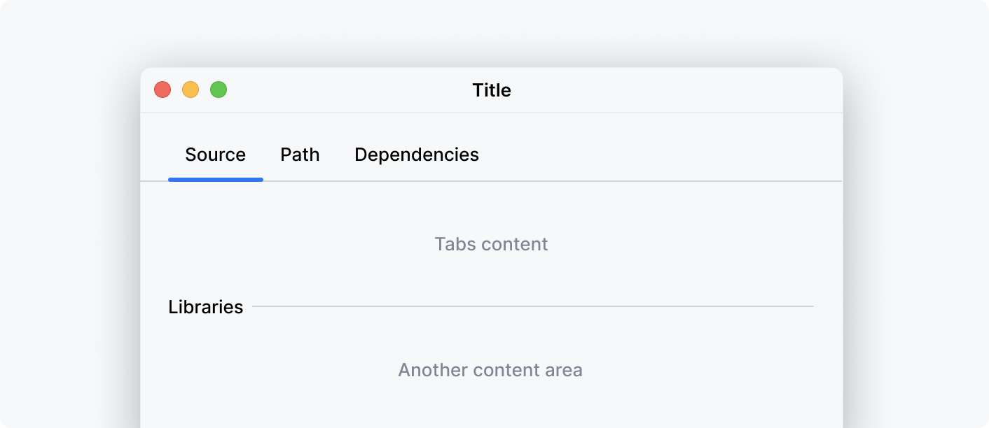
Do not place independent content under the tabs. Create separate tabs for such content.
Correct

Incorrect

Controls above tabs
When there are other UI controls above tabs, separate them with a vertical indent.

Tabs border
Make sure the border of the tab reaches the edges of the area tabs occupy.
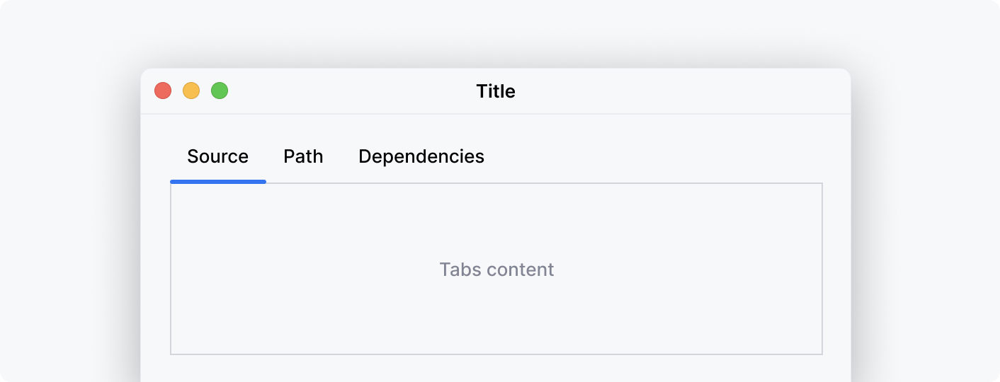
Do not surround the tab content area with a visible border.
Correct

Incorrect

Incorrect
