Button

When to use
Use a button to invoke an immediate action:

When not to use
 | Use a link instead if:
|
 | Use a toolbar button instead if there are several buttons related to a table or list. |
 | Use a split button instead if:
|
 | Use a built-in button instead if it's related to an input field, combo box, search field. |
How to use
Label
Use an action name as a button label.
Use title capitalization
Use title capitalization for button labels.
Use imperative verbs
Write the label as an imperative verb, for example, Save, Print, Cancel. Use title capitalization.
Be specific
The button should answer the question in the title, so the user can skip the description. Prefer specific labels over generic ones:
Correct

Incorrect

Do not use the word Now in labels because buttons always trigger an immediate action:
Correct  | Incorrect  |
Be short and clear
The label should be short, not more than five words. If it’s not obvious what element the button is related to, add more words to make it clear. Prefer clear labels to short ones:
Correct  | Acceptable  |
Ellipsis
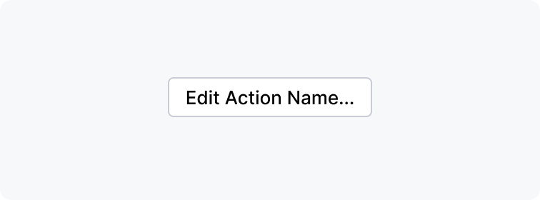
Add an ellipsis if additional actions such as adding more info or confirming the action are required.
Don't add an ellipsis if another window is opened, but no more input from the user is required. For example, About, Details.

Button states
Default

The default button confirms the main purpose of a dialog. It is triggered by pressing Enter or Ctrl+Enter on Windows/Linux and Enter or Cmd+Enter on macOS.
The default button should always be present in a dialog. Only one button in a dialog can be the default one.
If an action that a default button performs is dangerous, which means it can lead to data loss, there should always be an easy way to undo it. Otherwise, use a secondary button for a dangerous action and a default button for a safe action:

Focused

All buttons can get focus, even on macOS if the Full Keyboard Access option is disabled in Preferences > Keyboard > Shortcuts. A focused button behavior varies on macOS/Linux and Windows.
A focused button is invoked by pressing Space. Focused and default buttons are independent, so when the focus moves from one button to another, the default button does not change.
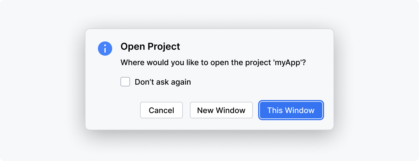
Make the second most popular button in the dialog focused. It’s recommended to have one default and one focused button so that most of the actions can be triggered using the keyboard.
It’s recommended to have one default and one focused button so that most of the actions can be triggered using the keyboard.
The focused button is triggered by pressing Enter or Space. If a non-default button gets focus, the default button is invoked using Ctrl+Enter.
On pressing the Tab key, the New Window button gets the focus and is triggered with Enter or Space. The original This Window button is triggered with Ctrl+Enter.
If the focus moves to the control that’s not a button, the original default button is triggered by Enter.
Correct

Incorrect

Disabled

Disable a button if:
The control to which the button is related is disabled.
Not all required fields in the dialog are filled.
Other standard buttons are described below. They can be regular or default buttons.
Hover
On hovering over a button, show a tooltip with the shortcut and the action name if it can be clarified. For more details, see Context help.
If the action is clear, show the shortcut only. If the action can be clarified, show the action name and the shortcut:

Common buttons
Apply
 | Use the Apply button in dialogs with many settings that affect how data is displayed. The Apply button allows you to save and preview the effect of the selected options and continue changing the settings, for example, change the editor color scheme in settings. The Apply should be disabled if no changes have been made in the dialog. |
Cancel
 | TheCancel button reverts the app to the state before the dialog was invoked and works as an equivalent to the Esc key. If a confirmation button is present in a dialog, for example, OK or Save, it’s required to have the Cancel button. If it is not clear what will happen on clicking the Cancel button, make the label more specific, for example, Continue Editing. |
Close
 | Use the Close label only if nothing can be changed in the dialog and there is no confirmation button, for example, in the dialog. In all other cases, use the Cancel button. |
Help
 | The help button appears in the bottom-left corner of a dialog and opens a documentation website. Add this button if the dialog's functionality is described in documentation. |