Got It Tooltip
A Got It tooltip informs users about a new or changed behavior and provides a short summary of the change.
Structure
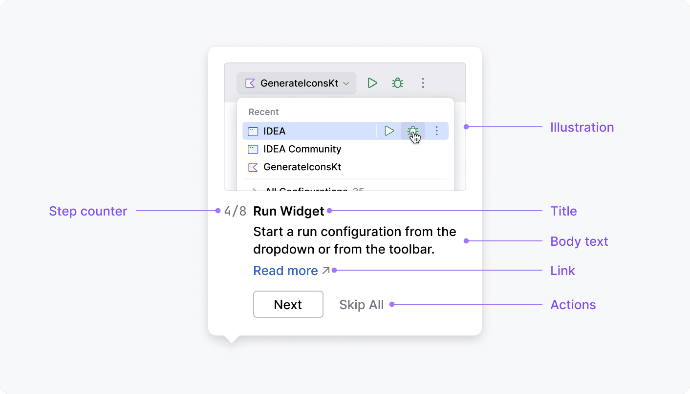
Body text
Always add the body text. Shortly describe what the tooltip is showing.
Don't use body text as a title.
Correct 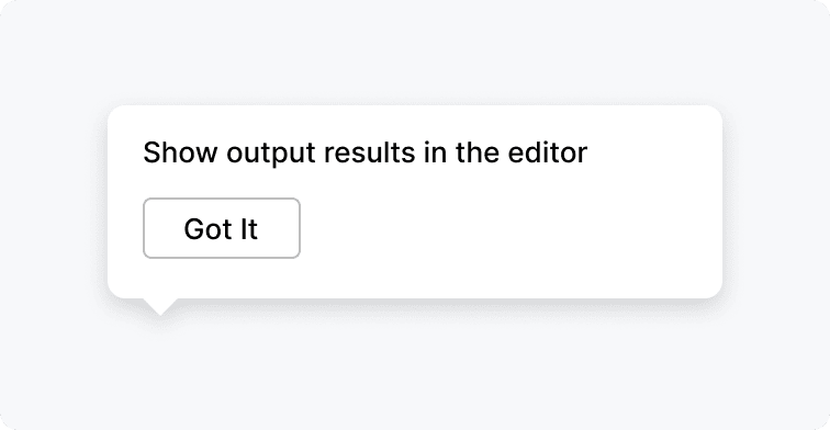 | Incorrect 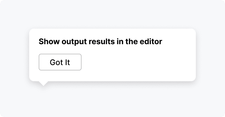 |
Title
Add a header if the body text is 2 lines and more. A header should be short and quickly explain what a tooltip is about.
Correct 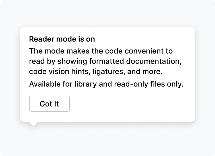 | Incorrect 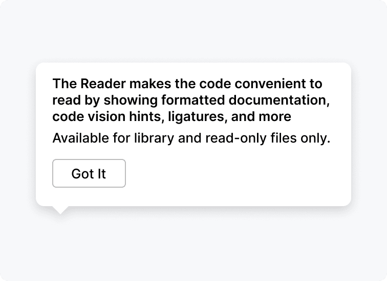 |
Implementation
Step counter
Use a step counter to number a sequence of related Got It tooltips.

Shortcut
Use a shortcut if the tooltip describes an action that has a shortcut.

Implementation
Link
Add a link if users might want to revert changes in a feature or configure it.

Implementation
Add an external link if there is a help source that can further explain the functionality.
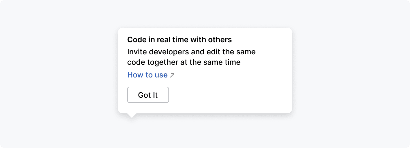
Implementation
When to use
Small UI controls
Point to small and essential controls that can be overlooked in a dense interface.
New feature
Introduce users to a feature improvement contextually when they start using it. Explain how it works and highlight its benefits.
Correct 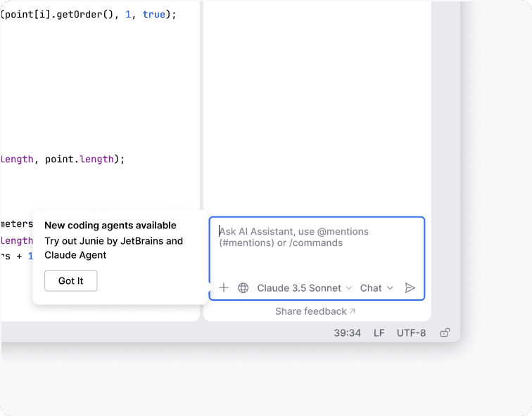 | Incorrect 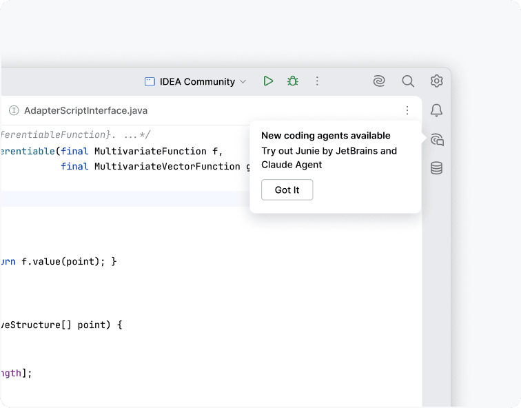 |
Changed behavior
Suggest a new pattern to a user's task that improves their workflow.
Ambiguous behavior
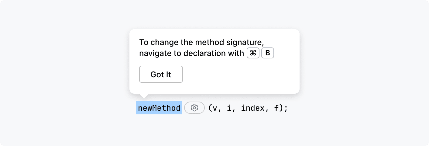
Explain behavior that is not clear from the UI.
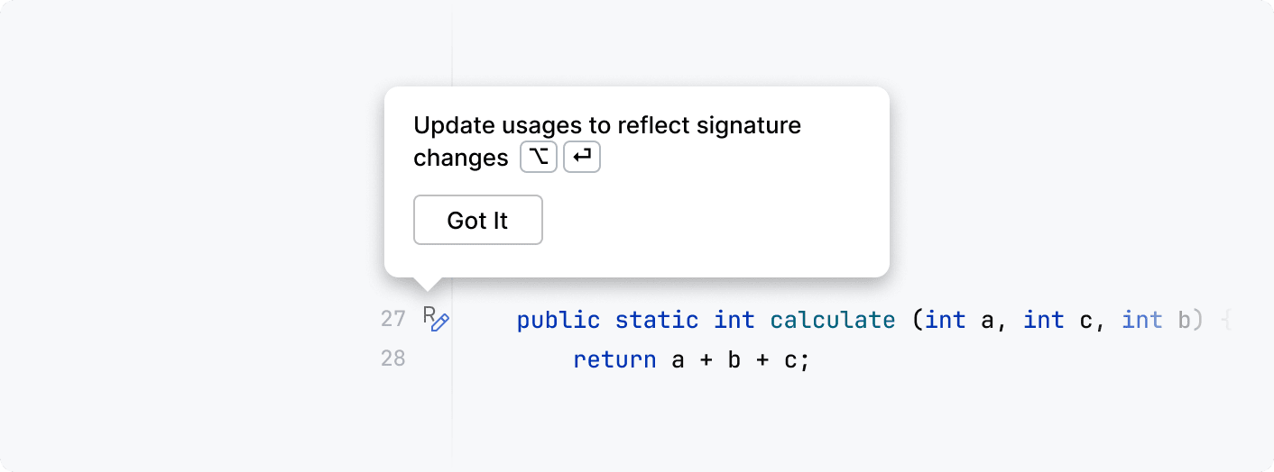
For example, when extracting a method, users can change only the method name in the blue box. The tooltip explains where to change the order of parameters in the parentheses and other properties of a method:
When not to use
Presenting a new tool
Don't use the Got It tooltip as a marketing tool. It distracts users, especially during startup. Use marketing channels for this purpose.
Nothing to point to
When there is nothing to point to in a dialog or a tool window, use a banner.
Correct 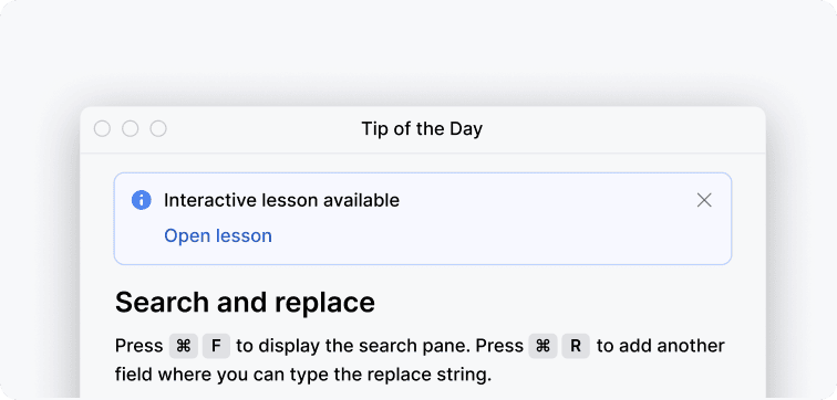 | Incorrect 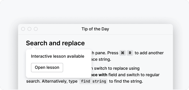 |
Feedback from the interface
Don't use Got It tooltips to give users feedback from the interface. Use notifications instead.
Correct 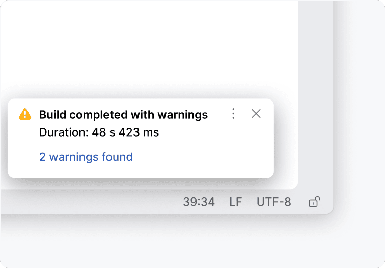 | Incorrect 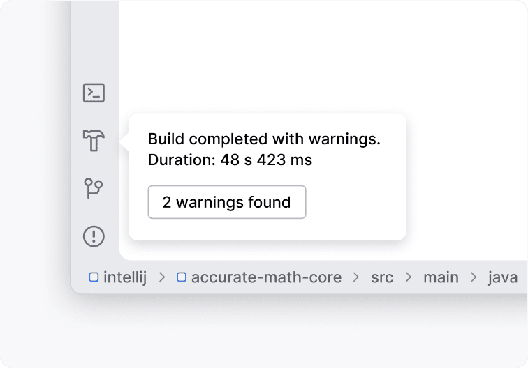 |
New option in a tree or list
For updates to frequently used menus, use a badge instead of a Got It tooltip to avoid disrupting the user's existing workflow.
Correct 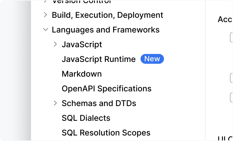 | Incorrect 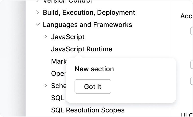 |
How to use
Single use
Show a Got It tooltip only once. Never show it again after the user closes it
Showing a group of tooltips
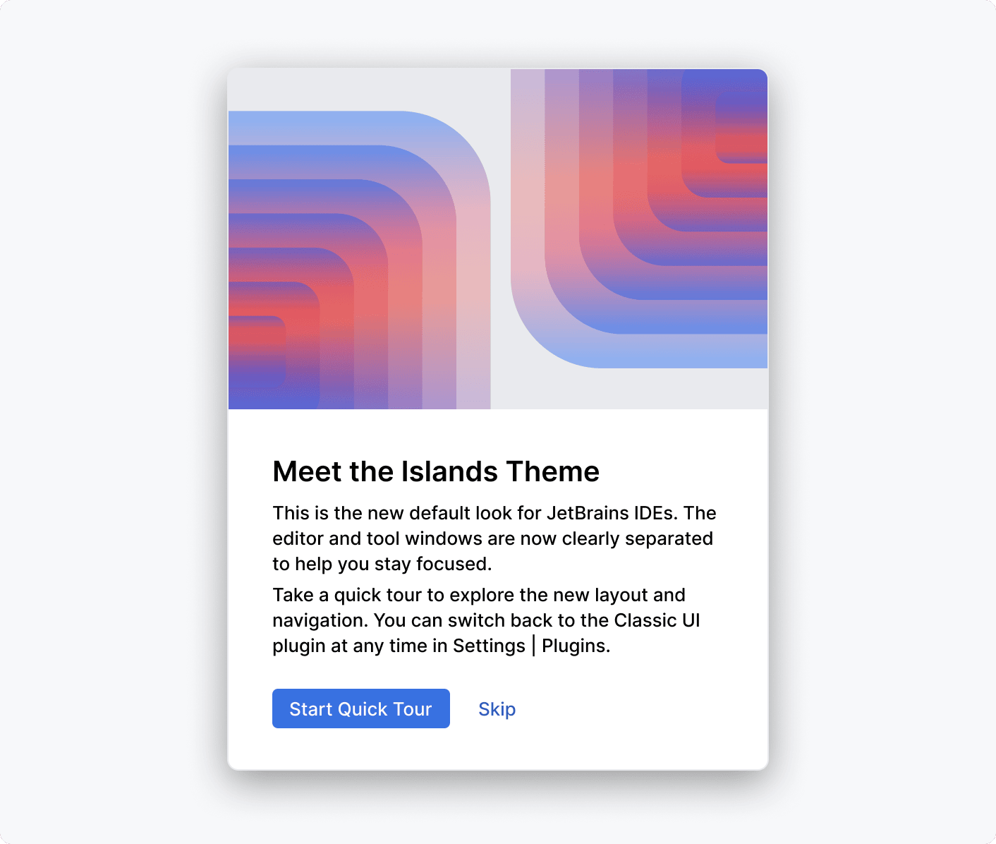
Show a sequence of tooltips only when users initiate it. Users can start a tooltip tour, for example, by pressing a respective button in the interface.
For example, Start Quick Tour initiates a tour of the new functionality:
Text length and formatting
Show no more than 5 lines of body text. If the text does not fit, leave only the essential information and add a link to a help article. Make the help text short and descriptive.
Use sentence case both for the header and body text, and follow the punctuation rules.
Don't use style formatting. It makes the tooltip harder to read.
Correct 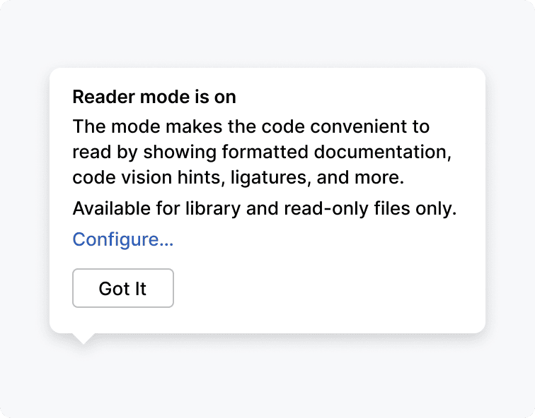 | Incorrect 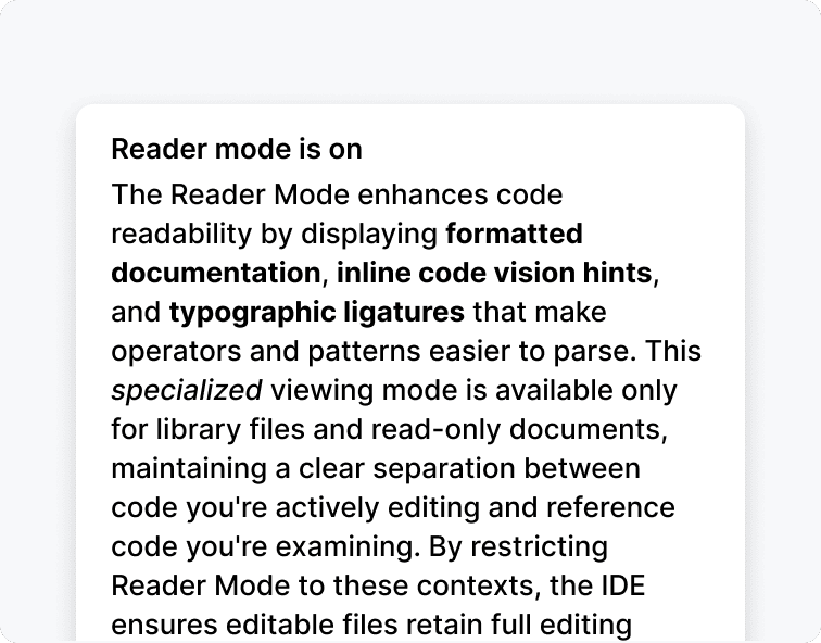 |
Positioning
Don't cover the information the user is currently working with.
Correct 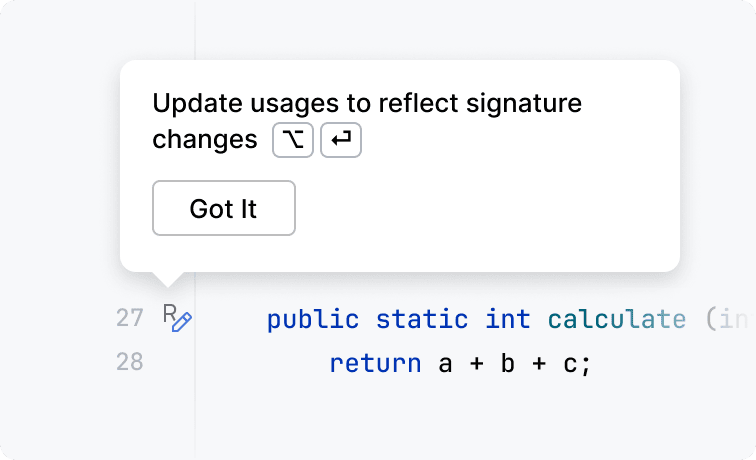 | Incorrect 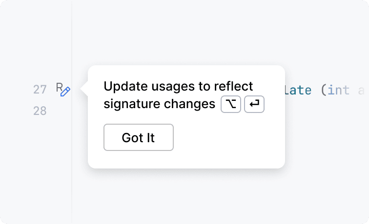 |
Implementation
See four predefined point providers in the GotItTooltip class.
Timeout for hiding
Consider adding a timeout if:
The text is no longer than 10 words.
The tooltip appears at the place at which the user is currently looking.
There is no link in the tooltip.
For example, the Got It tooltip has a timeout because the text is short, the user has just started the Rename refactoring, and is very likely looking at this place:

Implementation
Default timeout duration is 5 seconds. A custom duration can be set:
Versioning
If a tooltip is triggered by an action or plugin installation, do not tie them to the current IDE version. In this case, users might miss a tooltip if they are using this functionality or plugin for the first time in the next IDE version.
Built-in behavior
Frequency
By default, a tooltip is shown only once per user.
Closable
The tooltip disappears when:
Esc is pressed
User clicks any place outside the tooltip
On a timeout
Multiple Got It tooltips
If several tooltips appear at the same time, they are shown one by one.
Text width
The tooltip width adjusts automatically to make the right margin 16 px. Text width is 280 px by default.