Icon Button
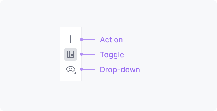
A toolbar icon button contains only an icon. There are three types of icon buttons:
|
When to use
Follow the guidelines for the Toolbar.
How to use
Icon
Use an existing icon or create a new one following the icon guidelines.
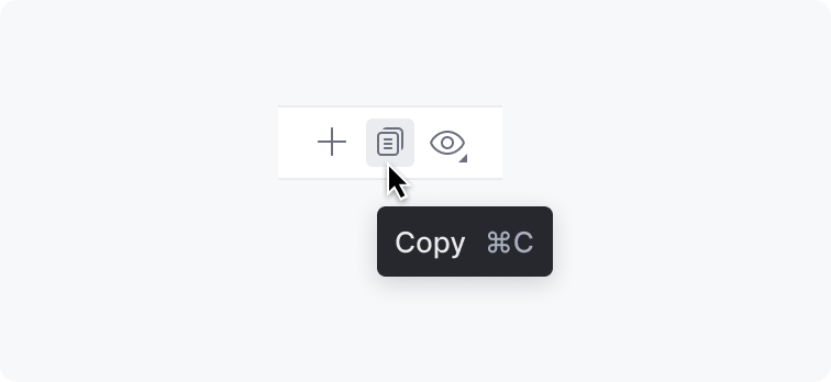
Tooltip
Always provide a tooltip for an icon button. Include a shortcut if there is one. See Tooltip for details. |
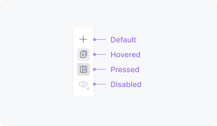
States
When an action is not available in a particular context, disable the icon button. |
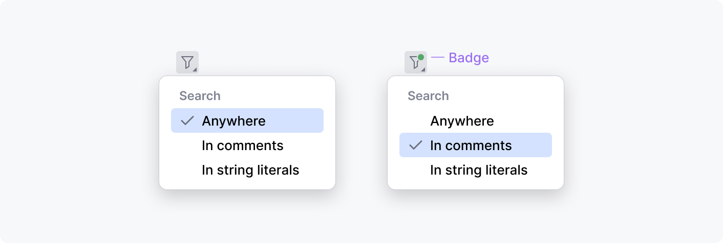
Filter badge

For filter actions, show a badge over an icon when a non-default option is selected. The badge helps to see if the content is in its default state or filtered.
Search option icon

Search option icons have a more noticeable pressed state to allow quickly seeing what affects the search results. See Search options for details.


