Progress Bar
A progress bar informs users about the progress of a lengthy operation.

When to use
Follow the rules for progress indicators.
How to use
Types
Use a determinate progress bar if the process duration is known. Otherwise, use indeterminate progress bar:

If an indeterminate process reaches a point where its duration can be determined, switch to a determinate progress bar:

Process name and details
A progress bar can have a process name and process details.
Process name
Show the name of the operation being performed above the progress bar:

If the vertical space is limited, place the process name with a colon on the left:

Process details
Show information about the current stage of an operation to make long-running tasks more predictable and manageable.
Show details below the progress bar on a single line. The length of details is limited by the width of the progress bar.

For wording, follow the rules for progress text.
Examples:
The current step: "Uploading file 3 of 10"
The name of a file, module, or library: "Fetching guava-31.1.jar"
Remaining time or percentage completed
Process controls
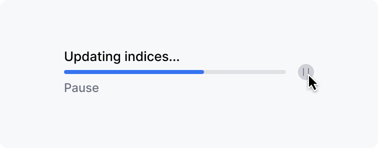
Place process controls on the right next to the progress bar. On hover over the icon, show the name of the control under the progress bar instead of process details.

Cancel or Stop button
Add a Cancel button if the process can be safely interrupted. If interrupting the process does not restore the system to its previous state, name the button Stop.

Pause button
If the process takes a long time and can prevent the user from performing tasks, provide an option to pause a process.
 | Replace process details with the "Pause" comment on hover over the Pause icon. |
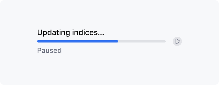
 | If a user pauses the process, show "Paused" under the progress bar. Replace the Pause icon with Resume. |
 | Show "Resume" under the progress bar and when hovered over the Resume button. |
Placement
If you need to use the progress bar among other controls, place it close to the control that starts the process.

In dialog or popup
Use a process name as a dialog or popup header, capitalize the title and remove the ellipsis. Process details appear above the progress bar. For a single progress bar, use a button to cancel or pause the process instead of an icon:

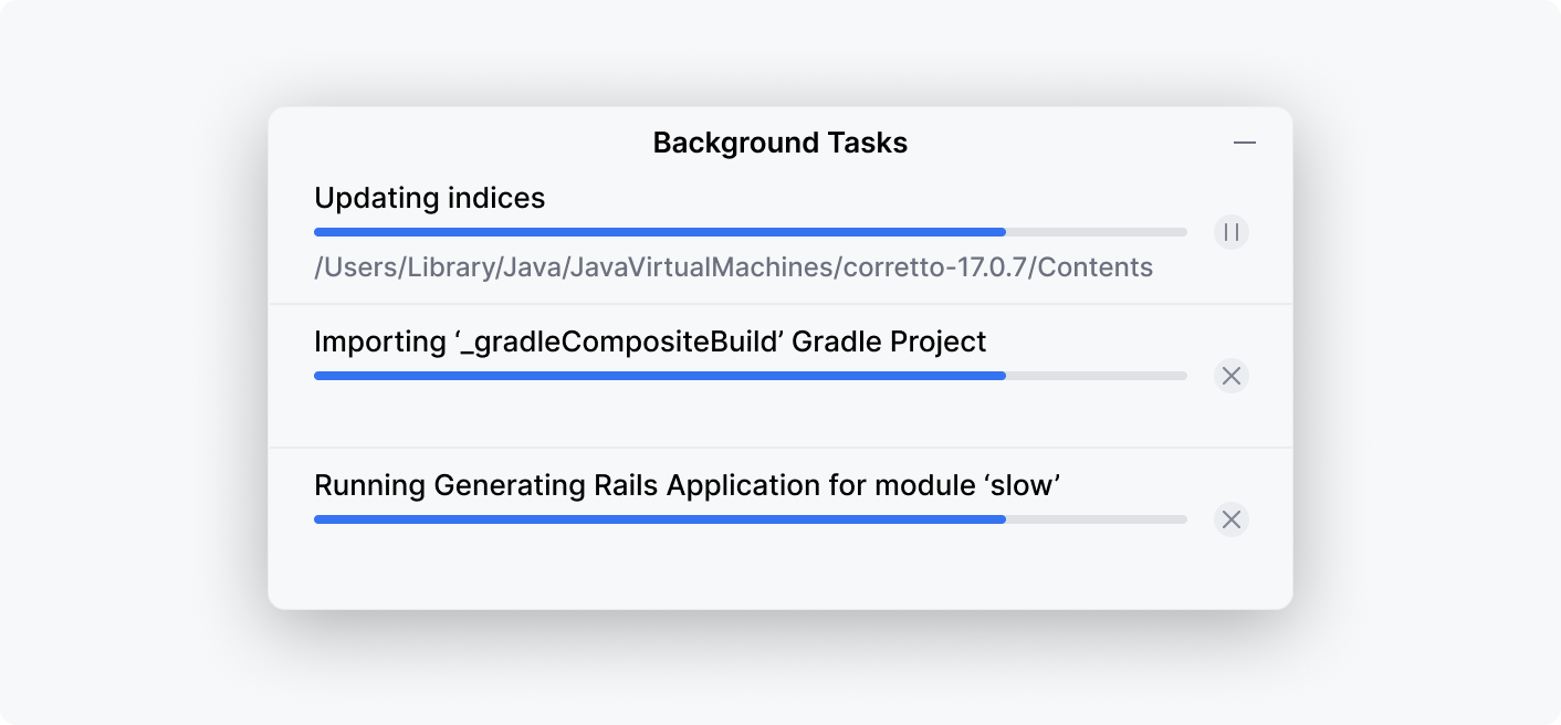
For several processes in a group, add a common header and use icons for process controls:

Inline progress
Use inline progress to indicate that content is being updated. The user can continue working with the content, but should see that a background process is in progress.
Do not show a process name for an inline progress.

Process status
If a process consists of substeps that can fail but do not terminate the process, then use green and red colors to show the intermediate status. For example, show the status of the running tests:

Process complition
Hide the progress bar as soon as the process completes.