Empty State
Empty states of tool windows, lists, trees, tables, master-detail layouts, or other container components should be informative for the users. Fill in the empty states with the following:

Reason why empty
Explain the current state
The default pattern is No [entity] added. If added, created, configured, or other words act as synonyms in a particular case, use added for consistency.
Correct  | Incorrect 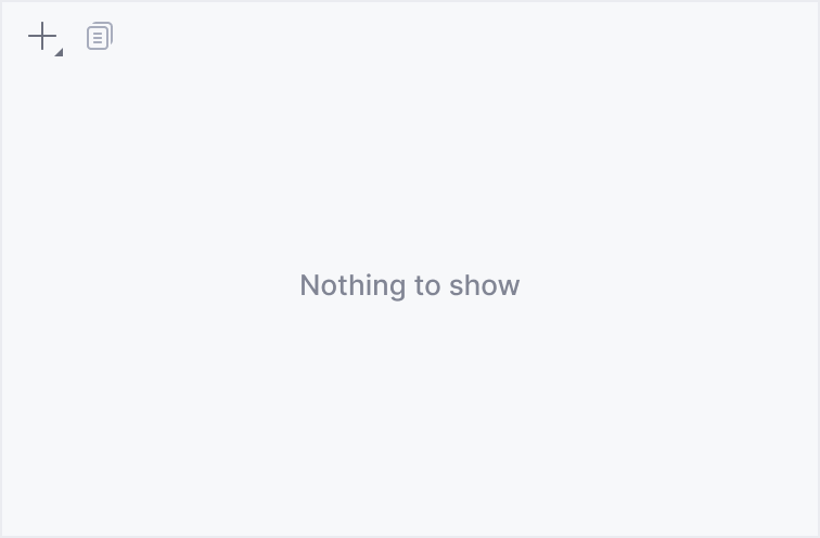 |
Be precise
Do not introduce new entities that are not used in the current context. Instead, use the terms from the current UI so that the user understands what exactly is missing:
Correct 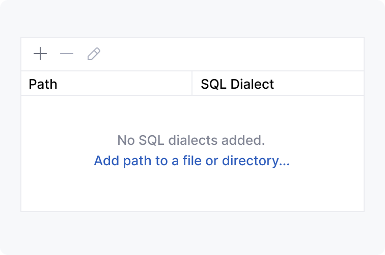 | Incorrect 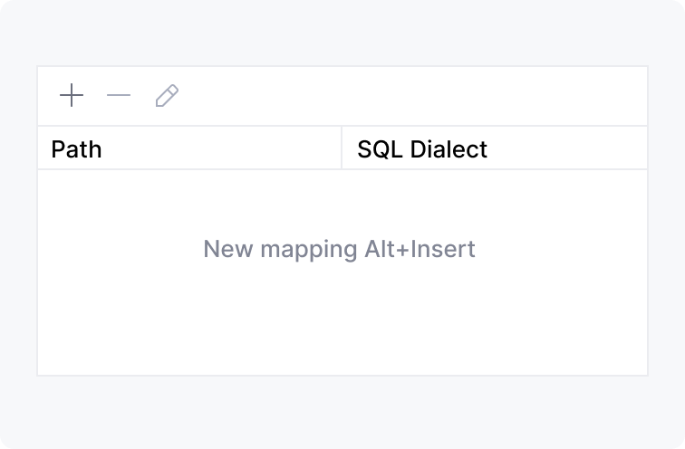 |
Actions to fill the area
An action makes it easier to understand what to start with instead of searching for the appropriate icon on the toolbar. It can also educate about the shortcut.
Use one or two actions
Three or more actions would make it harder to choose what to start from.
Correct 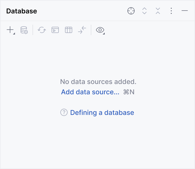 | Incorrect 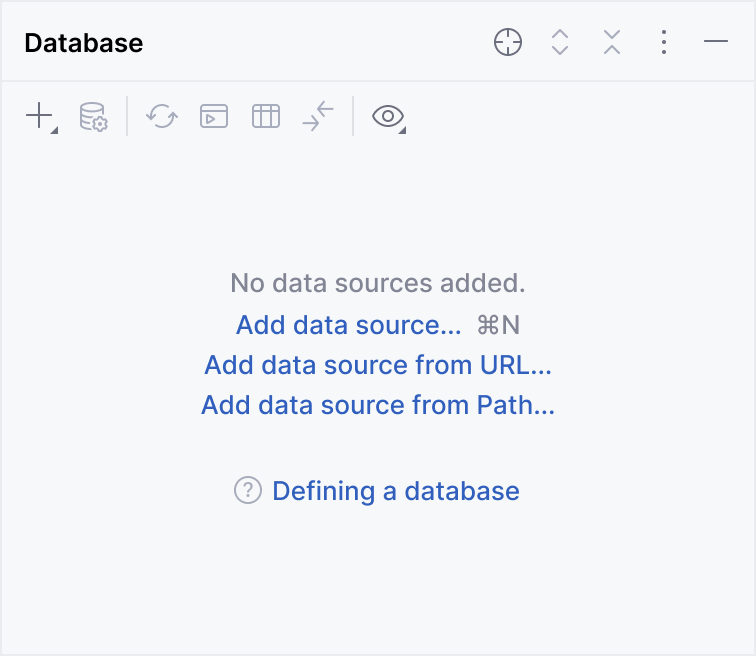 |
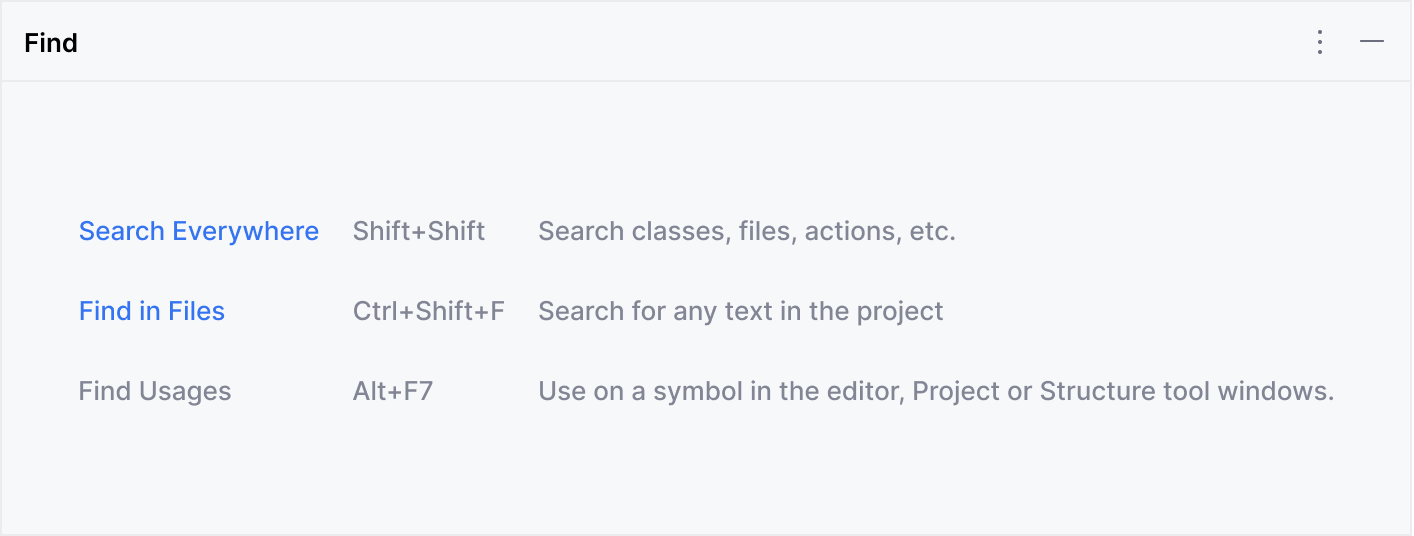
In rare cases, when you need to list all possible starting points, use the list layout.
If there is enough space (for example, in horizontal tool windows), you may use the table layout to place action links, shortcuts, and action descriptions:
Open menus from the toolbar
If an action opens a toolbar menu, open it at the same position where it would be opened with the corresponding toolbar button. This would explain which toolbar icon opens the menu.
Correct 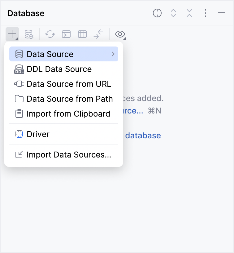 | Incorrect 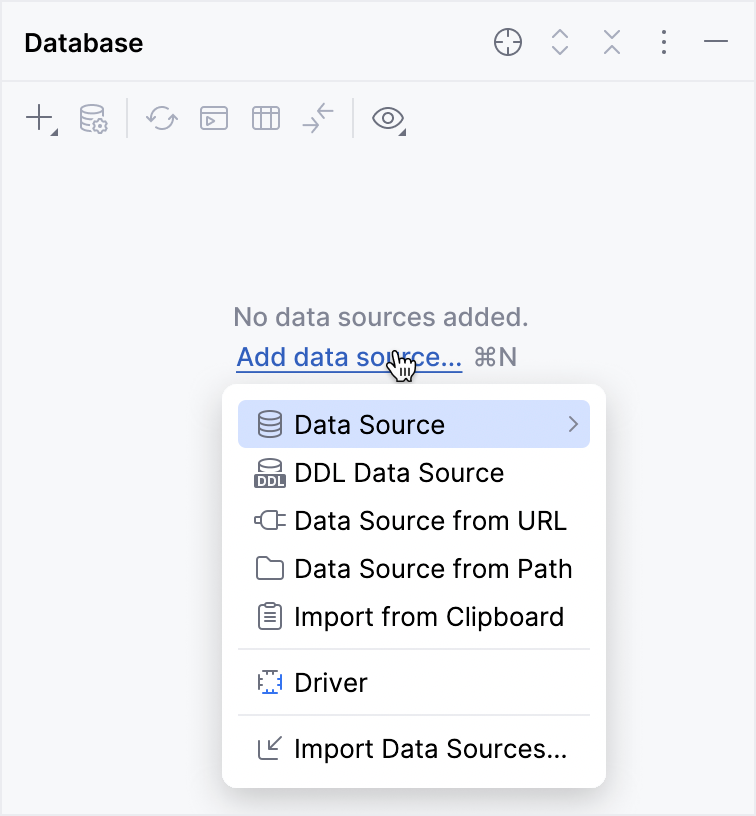 |
Explain what to do when there is no action`
If there is no action that can be performed by clicking a link, add a text describing all the required steps:
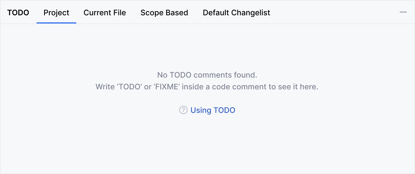
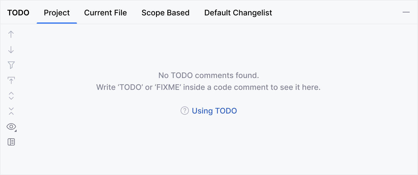
Hide the toolbar
Hide the area's toolbar if it does not have the same action as in the empty state. Usually, all other toolbar actions are not relevant in this case.
Correct

Incorrect
Help topic
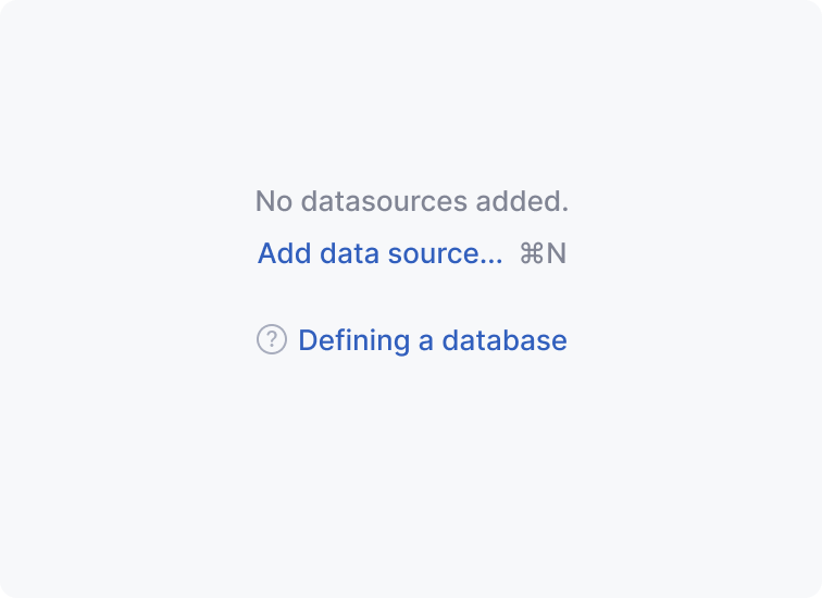 | Link to a help topic In tool windows and master-detail layouts, provide a link to a help topic that explains the functionality. Add the question mark icon in the beginning. |
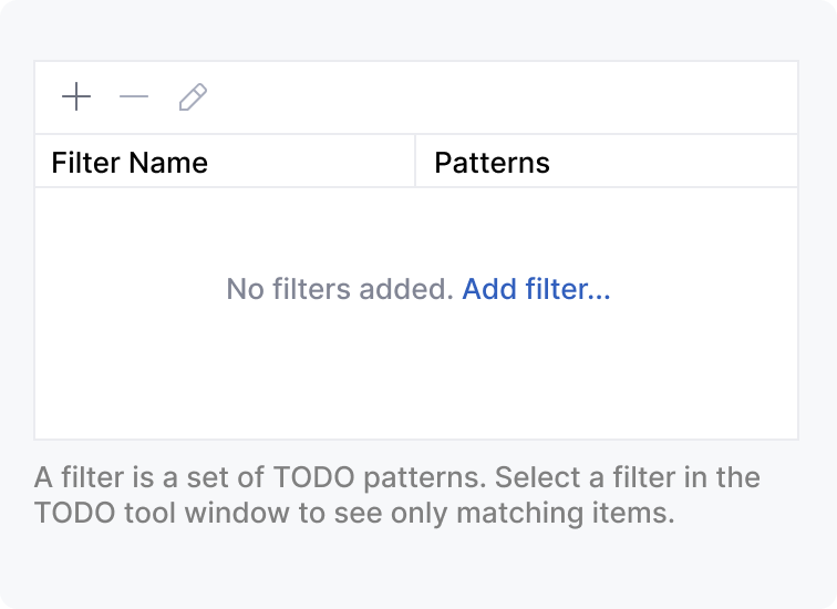 | Context help in inline hints In tables, trees, and lists, provide instructions according to the inline text help rules. Avoid using question mark links in these cases because such components rarely require deep explanations. |
Empty state of the master-detail layout
Master-detail layouts include a list or a tree on the left (in the master part) and the details area on the right.
If the master area is empty, display the explanation, action, and link to the help article.
If the details area is empty, no explanations are needed. In this case, show the actions to fill in the area.

Writing guidelines
Punctuation
Separate sentences in the empty state with periods, but do not put a period after the action link. Use the ellipses at the end of the action link if this link opens a dialog or a popup which requires some input from the user.
Correct 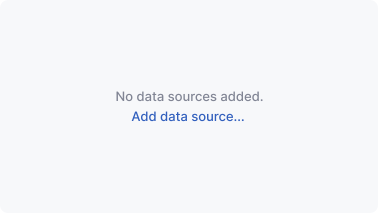 | Incorrect 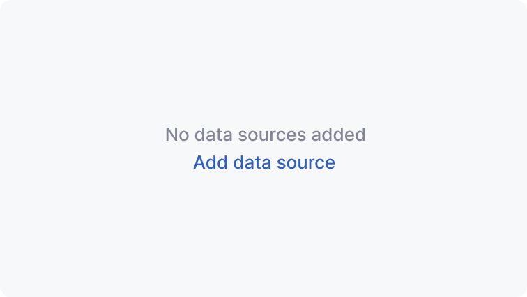 |
Capitalization
Use sentence capitalization in the empty state texts and links.
Correct 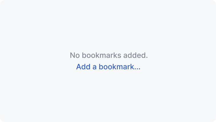 | Incorrect 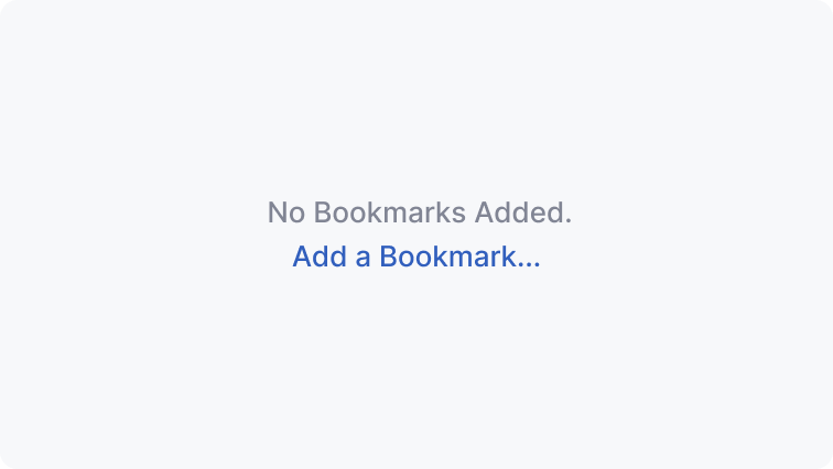 |
Avoid excessive verbs
In actions, avoid words that describe physical actions like
pressorclick— they are obvious from how the link works.Avoid saying
add new. Just useaddbecause all that is added is new in the context of an empty UI area.
Correct 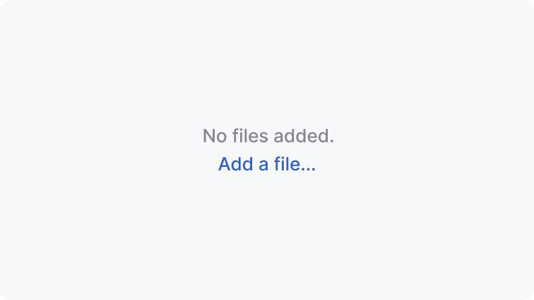 | Incorrect 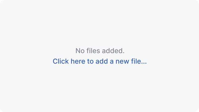 |
Sizes and placement
Vertical spacing:
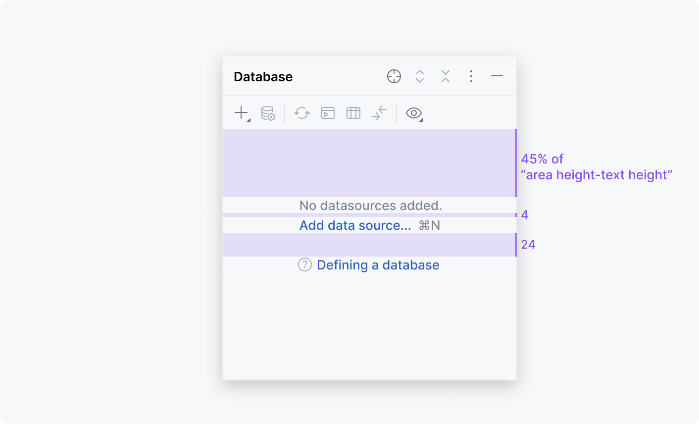
Minimum right and left margins:
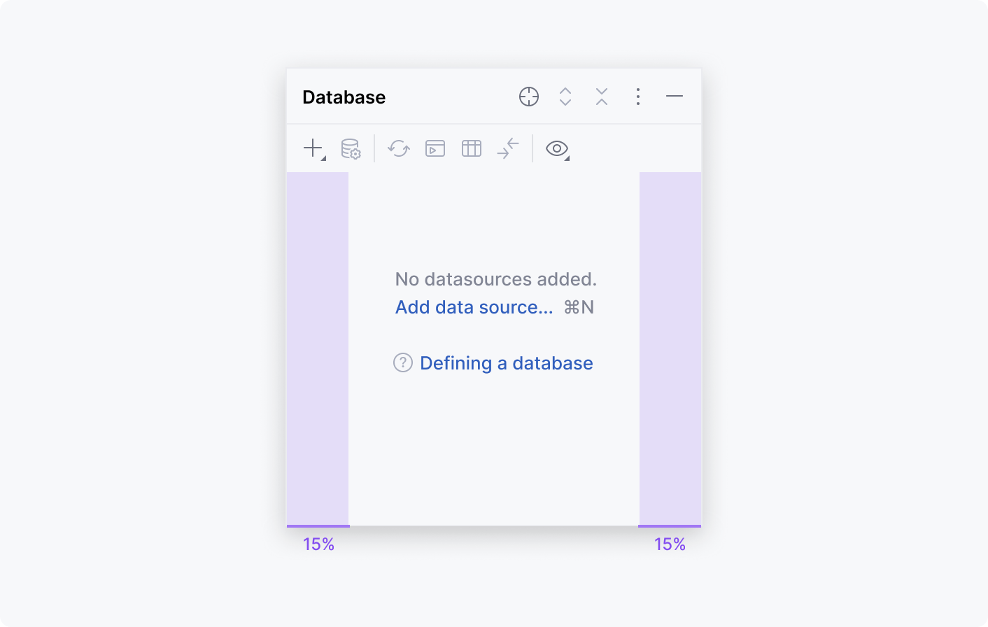
Use non-breaking spaces in the following cases:
Between action names and shortcuts
For articles and prepositions
Correct 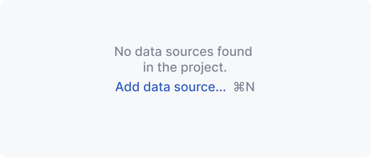 | Incorrect 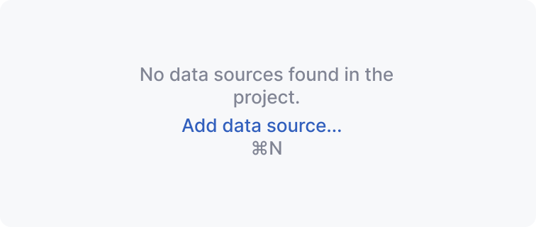 |