Tooltip
A tooltip appears on hovering over a UI element and shows an action name or provides useful information about an action or a setting.

When to use
There are three types of tooltips:
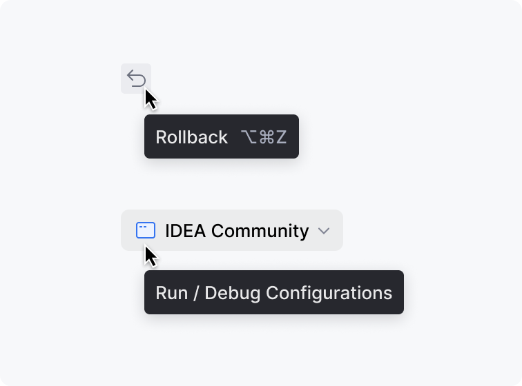 | Action Shows an action name or label for icons and unlabeled controls such as main toolbar widgets, and a shortcut if available. Required: action name Optional: shortcut |
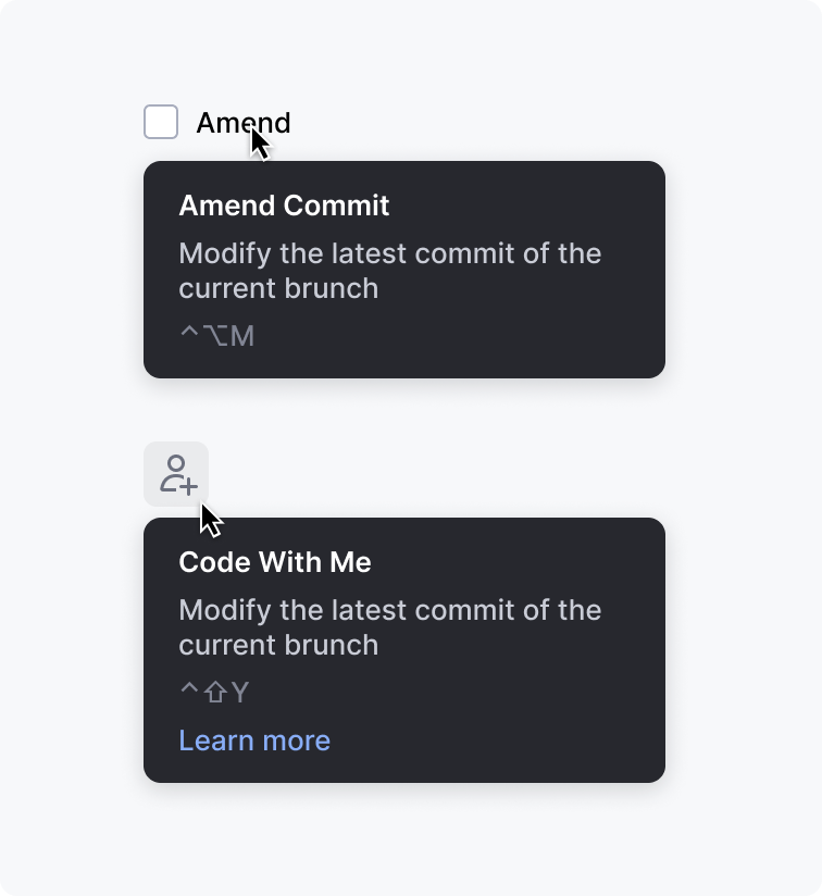 | Action help Shows help text for icons and unlabeled controls in addition to an action name or label. Required: action name, help text Optional: shortcut, link |
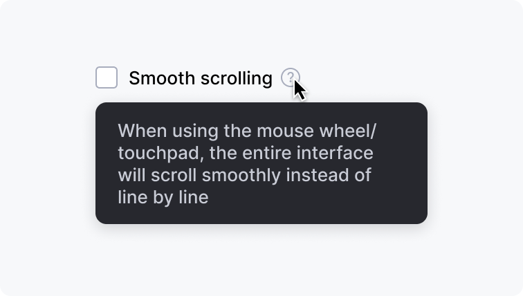 | Help Shows help text for all other controls. It is shown on hovering the question mark icon. Required: help text. Action name or label is not required because it is shown in the UI. Optional: shortcut, link. |
All icons and unlabeled controls should have an Action or an Action help tooltip.
Use Action help and Help tooltips according to the Context help rules.
How to use
Shortcut
Always show a shortcut if an action or a setting has one.
Do not show a single shortcut in a tooltip:
Correct 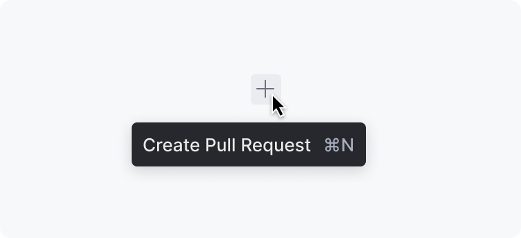 | Incorrect  |
Link
Provide a link to a source that can further explain the action or the setting. A link can navigate to a place in the IDE or to an external help article:
Internal link 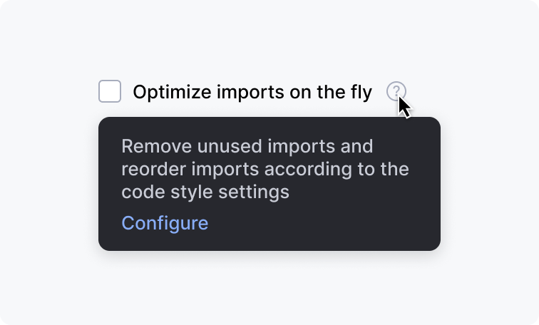 | External link 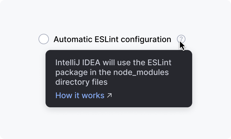 |
Do not show just an action name and a link to a help article. Provide help text so that the user does not need to switch to a web browser:
Correct 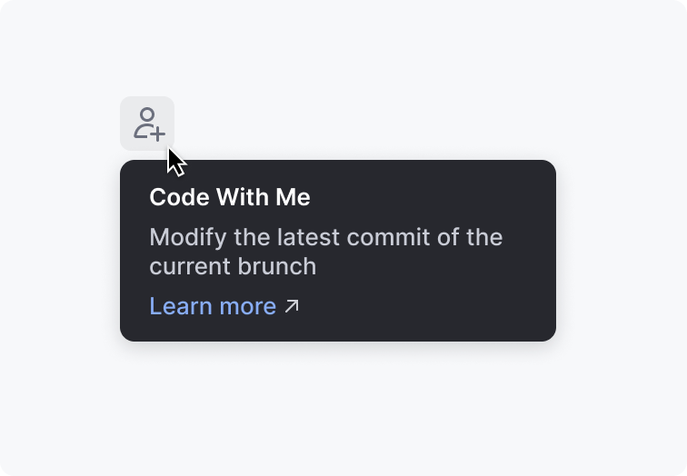 | Incorrect 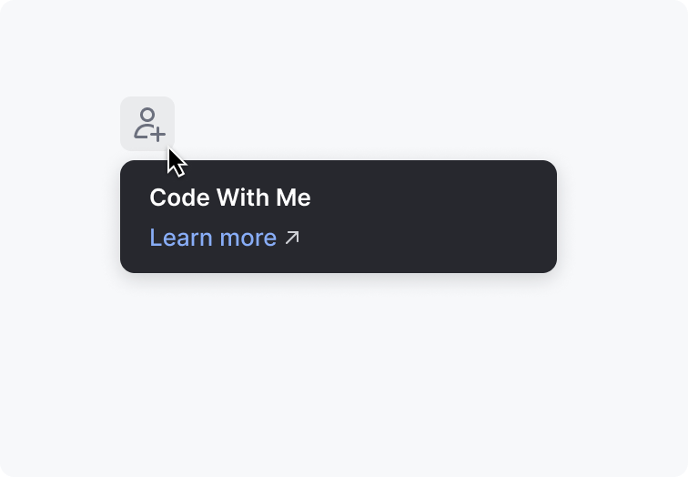 |
Text length
The text width in an action tooltip is not limited. The text width in a help tooltip is limited by 250px.
Show no more than 10 lines of help text. If the text does not fit, leave only the essential information and add a link to a help article.
Correct 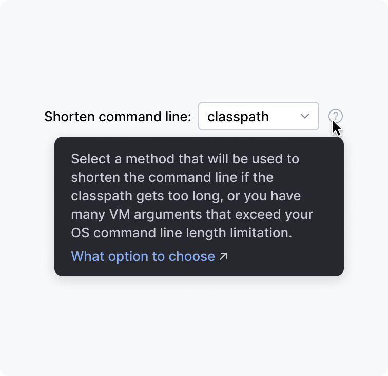 | Incorrect 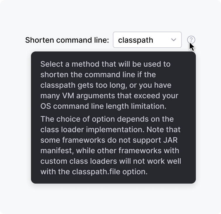 |
If the help text is longer than 5 lines, separate the text into paragraphs with the <p> tag. The <p> tag adds vertical space between paragraphs to visually separate them. Do not use the <br/> tag as it does not add space.
Implementation
Text style formatting
Avoid using style formatting in the help text. Usually, the text is short and no bold or italics are needed.
Correct 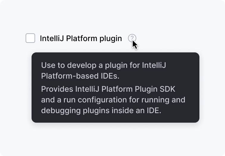 | Incorrect 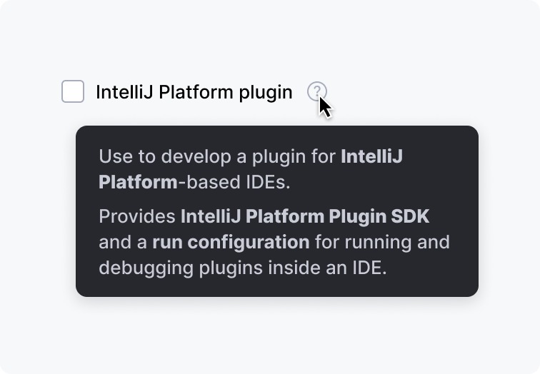 |
Writing guidelines
Make the help text short and descriptive.
In a help tooltip, do not repeat an action or a setting name in the text:
Correct 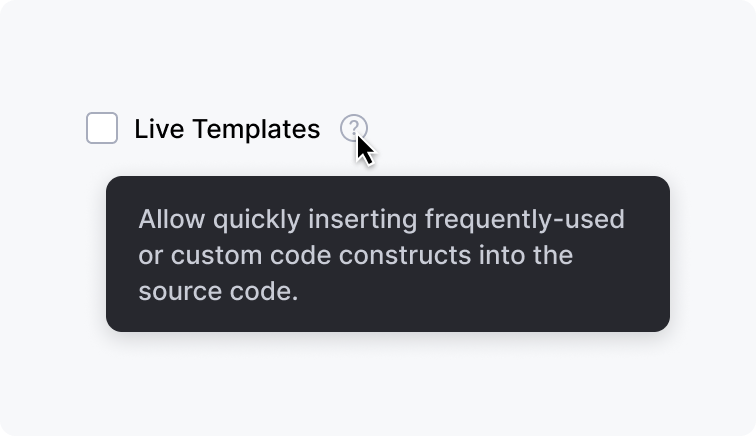 | Incorrect  |
Question mark icon for help tooltips
Always use the help tooltip with the question mark icon. Without the icon, it is unclear which component has help information.
Always place the question mark icon to the right of the corresponding UI component.
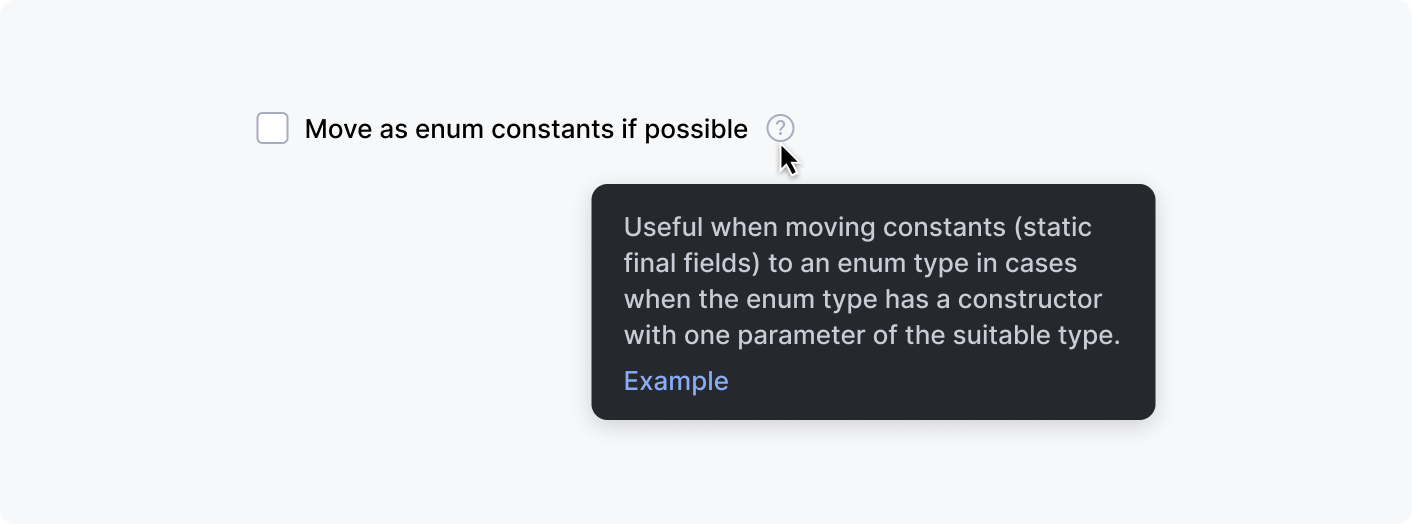
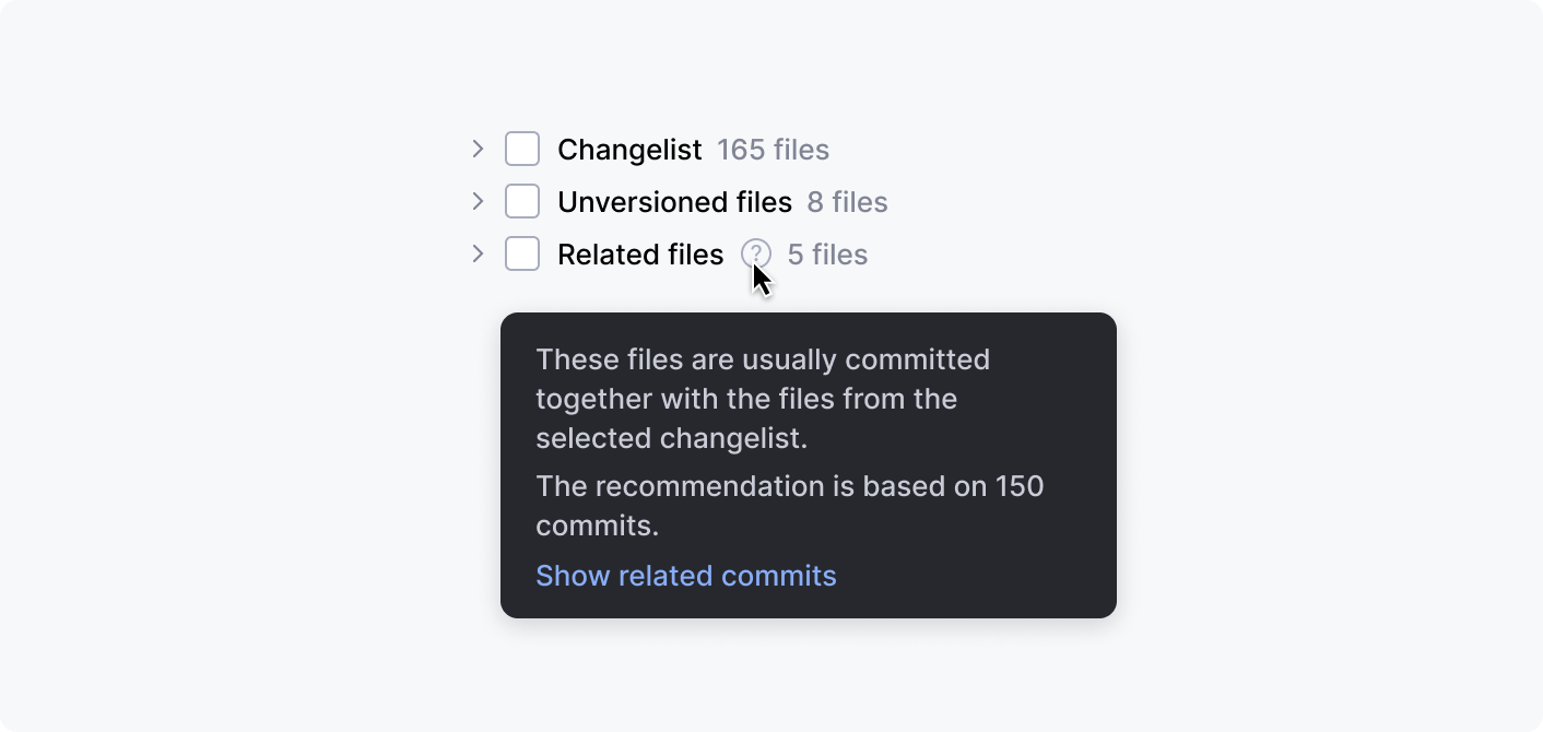
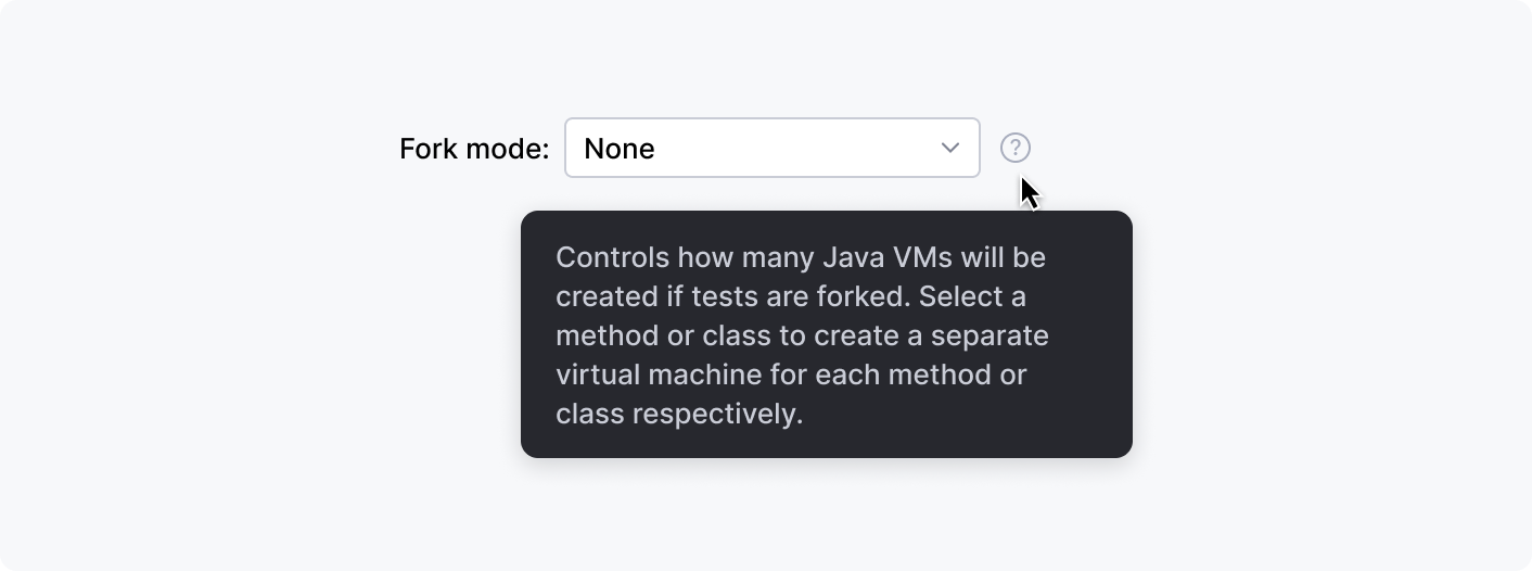
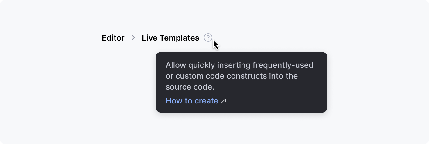
Examples with different controls:
Checkbox
Tree item
Labeled input
Group header
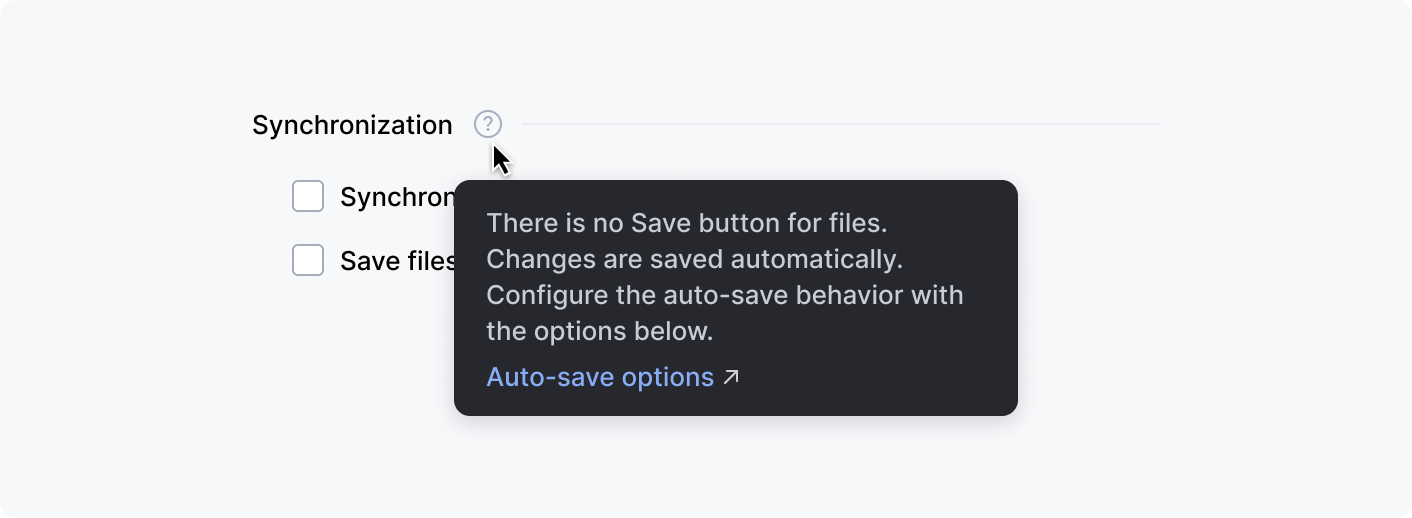
Settings breadcrumbs
Button

Exception: do not use the help tooltip with buttons at a dialog’s bottom. Put the information into the help article that is opened with the question mark button in the bottom left corner.
Correct 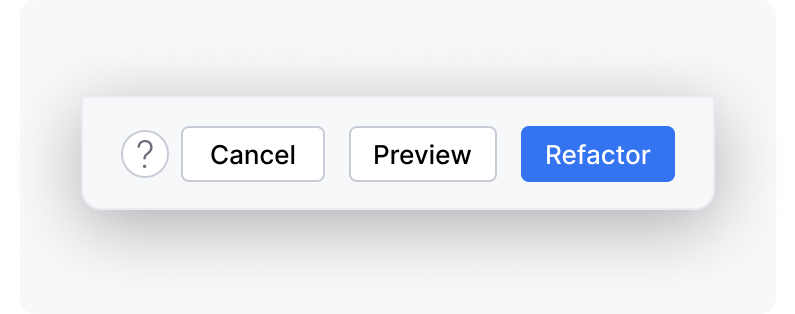 | Incorrect 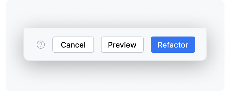 |
Built-in behavior
All tooltips appear on hover (not on click), including the help tooltip with the question mark icon.
All tooltips are hidden when the mouse cursor leaves the area that triggers the tooltip.
If the mouse cursor stays in the tooltip trigger area, tooltips are also hidden after a timeout specified in the table below.
Tooltip | Appears after | Hides after If the cursor is in the tooltip trigger area |
|---|---|---|
Action | 500 milliseconds ide.tooltip.initialReshowDelay registry key | 10 seconds ide.helptooltip.regular.dismissDelay |
Action help | 30 seconds ide.helptooltip.full.dismissDelay | |
Help | Never hides |
If a tooltip has a link, it is possible to move the mouse cursor over the tooltip. The tooltip does not close automatically when the cursor is over it.
Tooltips are positioned automatically depending on the mouse cursor location.